

Digital marketing
High-Converting Call-To-Action Buttons: Skyrocket Your Funnelish Sales
21 August 2022
Anna
6 minutes

We all know the struggle of creating strong call to action buttons that will actually showcase results. And if you find it hard to encourage users to click, don’t worry, many top-tier copywriters are struggling with this part as well.
As we navigate competitive 2026, getting website visitors to take immediate action requires more than just slapping a generic button on a web page. You need psychology, strategy, and impeccable design. We have put together a couple of tips, CTA best practices, and action examples on how to create a good CTA for your ecommerce funnels and beyond.
What CTAs to avoid?
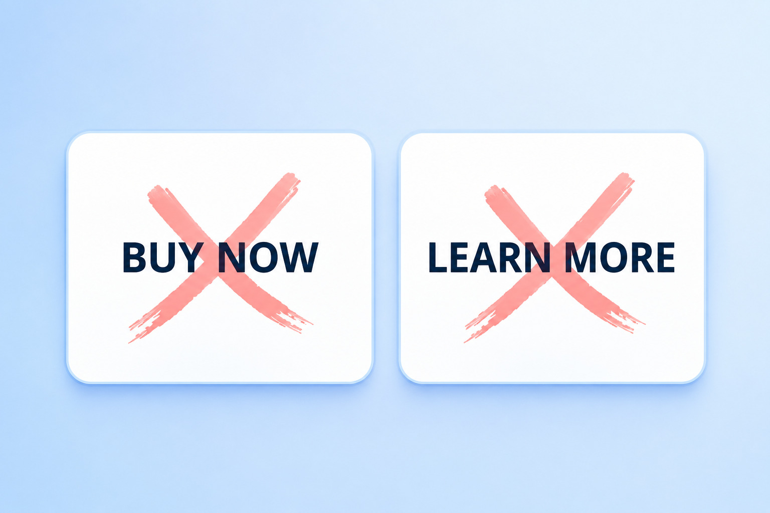
Let's start with the basics. Words like "Submit," "Click Here," "Buy," or "Enter" are conversion killers in 2026.
None of these outdated button CTAs would bring you the desired conversions. And yes, this might be shocking as you probably saw many websites still using them. The truth is, the audience is now more aware and smarter than ever. They have developed button blindness.
And as personalization is the definitive future of digital marketing, you do need to learn to know your target audience well and beyond and customize the CTA’s accordingly. Using personalized CTAs and straightforward language that speaks directly to their desires is the only way to prompt users effectively.
Strategy 1: Create unique CTA’s
Don’t fear risking and try to be innovative with your CTA language. You may be surprised to find out how well unique, tailored CTA’s can convert when perfectly matched to the target audience.
The goal of an effective CTA is to make the user feel something. Instead of a boring text link, use compelling CTAs that tap into human psychology.
CTA Example: FabFitFun
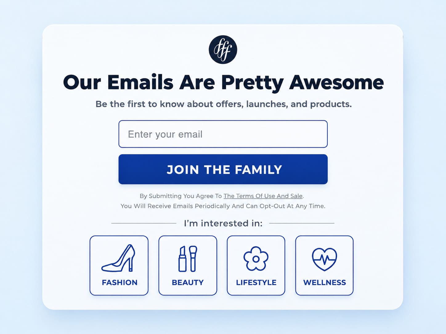
Consider how lifestyle brand FabFitFun has found a unique way of asking visitors to subscribe to their newsletter. By using the action words “JOIN THE FAMILY” and not the ordinary “SUBSCRIBE”, not only does this CTA button take advantage of our intrinsic desire to belong, but it also avoids putting in the visitor’s mind the idea of being subscribed to yet another spammy newsletter.
Using action oriented language combined with a sense of community is a great call to action strategy. When creating effective CTAs, always ask yourself: Does this sound like a chore, or does it sound like an invitation?
Strategy 2: Sell without selling!
You must pay extra attention to your CTA copy, even when you are offering free things like a free resource or a trial. Just because it doesn't cost money doesn't mean the user doesn't pay with their time and email address. You must clearly state the value proposition.
Let’s see some call to action examples:
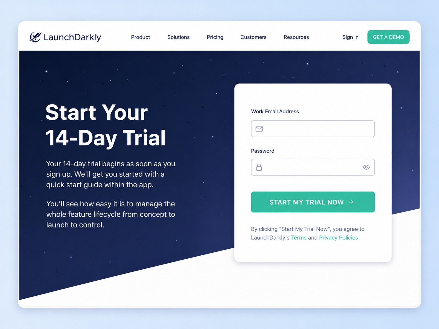
While LaunchDarkly’s landing page describes the ease of managing the whole feature lifecycle from concept to control, the call to action is plain ("START MY TRIAL NOW") and does not show too much value for the visitors. It fails to compel users.
On the other hand, here is a great CTA example of how Shopify has written the exact same offer:
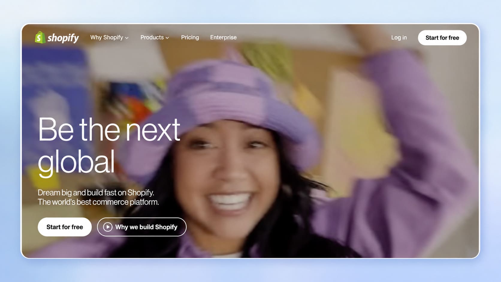
Because everything is sweeter when is FREE, you can see how Shopify has not only given a trial same as the other company, but also emphasised on the word FREE which is, perhaps, one of the strongest words used in copywriting. They use clear and concise language to directs users.
Another quite important fact to bear in mind would be the consistency in colors and visual appeal. As in the first example, different, clashing shades of green are used. Shopify, however, has kept the same white color throughout the whole main points of the page, ensuring the visual elements build trust. To draw attention to your primary action, you must use contrasting colors against the background and provide ample white space around the button so it isn't buried under feature text.
Therefore, learn how to sell your trial. Don’t ignore this step, as optimized free trials have been proved to increase revenue by over 25%.
Strategy 3: Call up curiosity with your CTA’s
Curiosity makes you want to jump on an offer because you can envision the reward and how it can improve your own life. Therefore, if you are using a funnel to distribute a lead magnet, for example, a free ebook, consider avoiding the ordinary “DOWNLOAD NOW”.
Instead, what you could do is make your visitors curious about how that book can improve their life. Sparking a sense of urgency through curiosity is a powerful CTA framework.
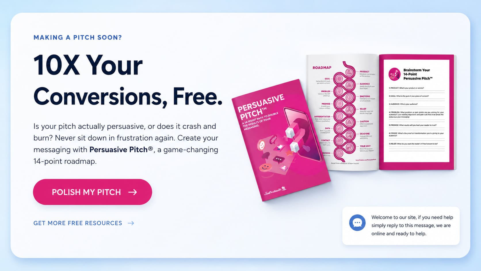
This is a very good example from JustPositionIt. This landing page has:
A strong, motivational headline. (10X Your Conversions, Free.)
Describes the benefits of getting their e-book WITHOUT revealing too many details. (Increases curiosity)
A perfect primary CTA – “POLISH MY PITCH”.
Notice the use of the first person phrasing ("my pitch"). This subtle shift in CTA language massively increases conversion rates because the user has already subconsciously claimed ownership of the item before they even click. It sells without selling, makes the customer aware of getting something for free, so that not necessarily consciously, the book would be downloaded.
Strategy 4: Hierarchy of Action (Primary vs. Secondary CTAs)
One of the biggest mistakes you can make on a standard web page is presenting the user with multiple calls to action of equal weight.
In a standard online store, a user might see a button to "Buy Now," another to "Read the Blog," and another to "Follow us on Instagram." This creates decision fatigue. In a highly optimized Funnelish funnel, the customer journey is linear. There should only be one desired action per page.
If you must include additional resources or options for further action, you should use secondary CTAs. A secondary CTA should be visually de-emphasized. For example, your primary action (e.g., "Yes, Upgrade My Order") should be a massive, brightly colored, clickable button, while the secondary action (e.g., "No thanks, I don't want to save 50% today") should be a simple, smaller text link.
Having competing multiple CTAs dilutes the user's attention. Strategic placement in prominent locations ensures the user knows exactly what to do next to take action immediately.
Strategy 5: Mobile Optimization is Mandatory
In 2026, the vast majority of your traffic — whether from an organic blog post, a TikTok video, or a Facebook Ad — is coming from mobile devices.
If your call to action is tiny, hidden at the bottom of a long scroll, or surrounded by cluttered other elements, your potential customers will bounce. The visual representation of your action buttons on mobile must be pristine. They need to be thumb-friendly, stretch across the width of the screen, and ideally remain sticky at the bottom of the viewport so the user doesn't have to scroll back up to buy.
Bring It All Together With Funnelish
In the end, copywriting is an art and it is true that it can take years to learn. But paying attention to these kinds of details, analyzing user behavior, and doing constant research can make a significant increase in your conversions and direct sales.
However, you should never rely on guesswork. The absolute best call to action is the one backed by data.
This is where building your marketing campaigns on Funnelish gives you an unfair advantage. Funnelish allows you to effortlessly test ctas through built-in A/B split testing. You can run two identical pages with different cta copy (e.g., "Get Started Today" vs. "Claim My 50% Discount") and let the data tell you which one successfully encourages visitors to buy.
To create the perfect button:
Use action words and first person language.
Ensure it aligns with the core value proposition.
Design it with contrasting colors and heavy white space.
Remove distracting multiple calls to action.
Relentlessly A/B test your key elements.
Stop letting your traffic go to waste on weak, uninspired buttons. Guide users confidently through your sales process, use these call to action examples as inspiration, and watch your Funnelish revenue soar!
Table of contents
Boost your eCommerce
sales today

24/7 support
No credit card required
Cancel anytime
24/7 support
No credit card required
Cancel anytime
