Digital marketing
6 Ridiculously Easy Ways to Increase Your Funnel Conversion Rate
15 May 2021
Anna

In the e-commerce world, your funnel conversion rate is everything… No conversions = no money, so obviously a higher conversion rate = more money!
Let’s dive into 6 actionable steps that you can take to increase your funnel conversion rates – today! FYI – These are explicit changes to make to your actual funnel, not your overall marketing strategy or sales funnel.
Table of Contents:
What’s a Funnel?
Conversion Rates?
1. Provide A Better Checkout Experience
2. Leverage Social Proof
3. Create Scarcity & Urgency
4. Focus on the Benefits
5. Handle Objections
6. Level Up your CTA Buttons
Conclusion
First Things First: What’s a Funnel? What’s a Conversion Rate?
Lander gives a good definition of a funnel, a stand-alone web page that is designed to encourage a visitor to perform a specific task.
For us in the e-commerce industry, that specific task that we want visitors to perform is to PURCHASE!
A funnel often starts with selling one product, and once visitors purchase they are directed to 1-2 more pages that are encouraging them to buy complementary products at a special price, we call these upsells and down-sell.
What about conversion rates? Your eCommerce funnel conversion rate is the percentage of visitors that take your desired action. For example, if 100 people visit your site, and 2 of the purchase, that’s a 2% conversion rate.
What’s a Good Conversion Rate?
Overall, we see an average of anywhere from 1-5%, but average conversion rates vary greatly depending on what industry you’re talking about.
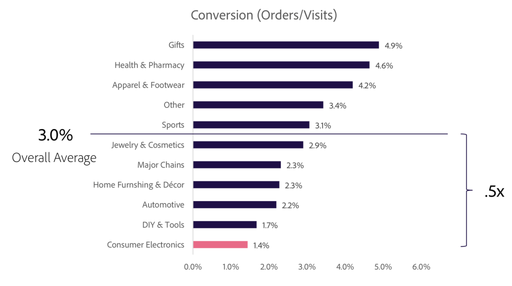
And when you start to factor in the difference in conversion rate from a traditional e-commerce storefront to a funnel, you’ll see an even higher increase.
So why write an article about 6 ways to increase the conversion rate on your funnels if it’s already higher than a normal e-commerce store?
Well, who doesn’t want more sales and higher margins??
So let’s get started!
1. Provide A Better Checkout Experience
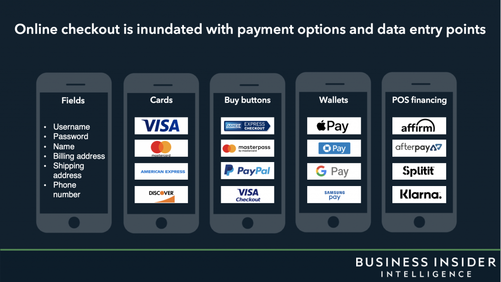
This first conversion rate booster is probably the biggest because it can be broken down into two main reasons.
Providing a checkout experience that is easier and has less resistance, and
Providing multiple payment methods that your customers trust.
So to start with the first one, I like to explain a certain term. Cognitive fluency is the human tendency to prefer things that are not only familiar but also easy to understand (source). Making your checkout form easy to understand makes the buying decision a little less tough.
Using 2-Step Order Forms (a popular funnel checkout method) you can have your customers first give you their name and email, then click the submit button, then enter their info.
This breaks up the process into smaller, easier-to-make mini-decisions. Less resistance = less likely they will feel overwhelmed and leave your page.
Now for payment methods. Every customer is different, and so only having one option to pay is definitely going to leave some money on the table.
Adding more payment methods, like PayPal and credit card options simultaneously can help increase sales by a whopping 30%, with over 45% of those sales being processed through PayPal.
Action Step:
Level up your checkout process and start using 2 Step Order Forms and add PayPal as an alternative payment method.
2. Leverage Social Proof
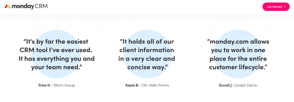
Using social proof, AKA testimonials is one of the easiest ways to build trust in your brand and your product. A testimonial is someone testifying the good in your brand, product, or service.
The good thing about testimonials is that they don’t just have to be from people the customer knows. 88% of consumers trust user reviews as much as personal recommendations.
Asking customers to leave honest written testimonials or reviews in exchange for a coupon or discounted product is a good way to stack up testimonials to add to your funnel.
The average consumer reads 10 online reviews before making a purchase decision. My recommendation? Double that. Add as many testimonials as you can, and in different formats too!
We’ve seen super successful funnels with screenshots of messages, emails, video testimonials, written ones, and so much more!
Action Step:
Ask your customers for testimonials (give them time after purchasing first), and then add them to your funnel.
3. Create Scarcity & Urgency
Have you ever heard of the term FOMO?
Fear Of Missing Out. People are afraid to miss out on something! Good e-commerce funnels use FOMO to their benefit and create feelings of scarcity and urgency on their pages.
Scarcity is the feeling that a product or service is in short supply and about to run out. Push users to purchase now or else the product will run out. Try adding an element to your funnel that says “Only X amount of this product left!” or something similar.
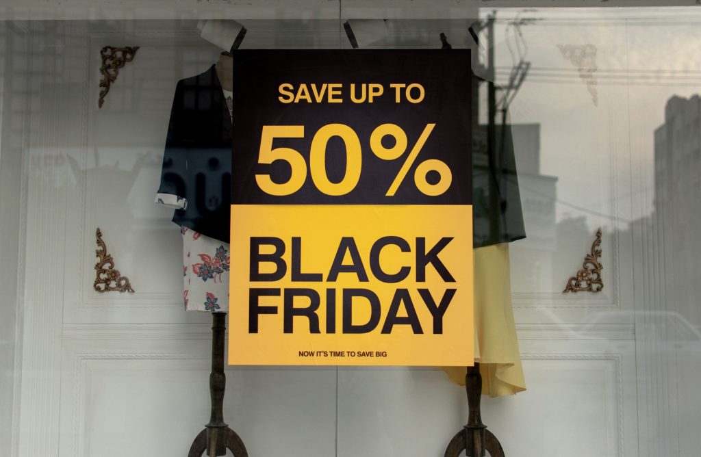
Urgency is when a buyer feels like they need to act quickly. These are usually time-based elements, for example, a countdown timer. There are a ton of ways to use urgency in your funnels – my favorite ways are to either have a countdown timer for a certain amount of time after a user visits your page or a date-based offer, like a Black Friday special.
Using scarcity and urgency in your funnels is a great way to appeal to more emotion-based people, and they do not want to miss out on your amazing offer!
Action Step:
Add a countdown timer to your funnel and tell users the offer expires in 8 hours (set it up so the offer actually goes away in that amount of time). Use verbiage such as “Only 8 spots left” and place them above the main button on your page.
4. Focus on the Benefits
Here’s the truth: People care more about what your product will do for THEM, than about what the actual product is.
Your funnel should definitely mention the product features but should FOCUS on the benefits a customer will have because of it.
How will your product make them feel? What struggles do they have that your product solves? How will this product make their lives better? You should answer all of these questions in your funnel, and add the most important ones to the top.
Let’s go over an example, say you’re selling a book teaching a language.
What you shouldn’t focus on (but still briefly mention):
Hard cover book
230 pages
Bonus bookmark
What you should focus on:
How a second language increases your chances of getting hired
How great they will feel to be able to speak 2 languages
It’s a great chance to cross this off your bucket list
Action Step:
List out your ideal customer’s struggles and desires, and how your product solves them. Add this info to your funnel in a way that shows them that these benefits are a part of the product.
5. Handle Objections
Think about how people make buying decisions in person. If they’re buying a car, they ask the salesperson every little question they have and the salesperson is typically ready to handle every objection they have until they walk out the door.
Or even if someone is at the mall and sees a product they’re interested in. Maybe there is no salesperson readily available to answer questions, but Google is certainly there at any moment for them to look for answers.
When people are “shopping” on your funnel the same applies. Simply put: They’re going to have questions.
By not answering their questions in the funnel you’re risking either:
They’ll lose interest, leave your page, and never come back
Or they’ll open a new tab and Google their questions, likely finding another place that answers their questions to purchase from instead.
Action Step:
People always have excuses not to buy something, so take away their excuses. Answer the questions they might have and tell them why they should buy now!
6. Level Up Your CTA Buttons
A Call to Action (CTA) is simply exactly how it sounds, your calling your visitors to take an action. You can see CTAs throughout the whole funnel, but what we’re focusing on here is specifically your CTA buttons.
Your main buttons are going to be what determines if someone is going to buy or not, are you convincing them that they should?
Your button should visually stand out, with bold color and clear button features. The text should be from their POV, so instead of “Book Your Time NOW”, change it to “Book My Time NOW”.
There are so many ways to level up your buttons, and some will clearly outperform others, so it’s important to test, test TEST!
Action Step:
Make sure your buttons stand out visually and test different copies. Try a simple one, but add copy around the button that’s action-oriented. Try one from their POV that describes the action and benefit they will get from it in one line. Look at competitors to get ideas for your own buttons.
Conclusion
Now after reading all of these tricks, maybe you’re wondering if it’s worth it to do any of these?
Well – let’s break it down. Let’s say you’re selling a $50 product. Let’s say you’re running ads or just have great organic traffic and you’re getting 10,000 visitors a month.
Your current conversion rate is pretty low, sitting at 1%. So now you add some testimonials, offer PayPal alongside your credit card method, and make your CTA buttons clearer and more convincing.
Your new conversion rate is 4%. You just went from $5,000 to $20,000 from a few simple tweaks…
Was it worth spending a few hours on funnel changes?
Your funnel conversion rate is everything, so it’s time to start acting like it.
Happy selling!
References:
Table of contents
Boost your eCommerce
sales today

24/7 support

No credit card required

Cancel anytime

24/7 support

No credit card required

Cancel anytime