

Digital marketing
12 Tips How to Build an Effective Landing Page in 2026
01 April 2023
Anna B.
7 minutes

Your landing page is more than an SEO asset that drives traffic and starts conversions — it's the first real interaction a customer has with your business. A great landing page sets the context, tells visitors what to do, and determines whether a click becomes a customer or a bounce. Get the landing page design right and everything downstream improves; get it wrong and you pay for traffic that never converts.
The stakes are measurable. The median dedicated landing page converts at around 4–6.6%, while the best landing page performers reach 11.45% or higher — a gap that rarely comes down to traffic and almost always to focus, page speed, message match, and form design. Below are 12 landing page optimization tips that move that number in 2026.
1. Understand the difference between a home page and a landing page
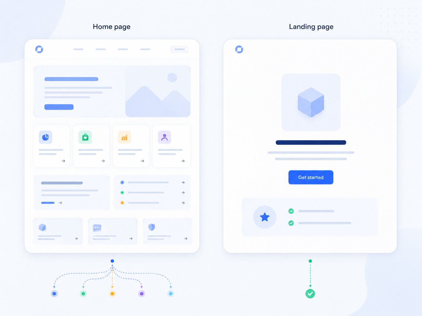
People still confuse the two, and the distinction matters. A home page is a general web page that invites exploration in every direction; an effective landing page does the opposite — it removes choices and guides visitors toward one desired action. Every link to other pages is a potential exit point.
The most disciplined high converting landing pages strip away global navigation entirely so the only meaningful path forward is your call to action. Build the specific page for one target audience (say, a single ad's traffic) and one goal, not for everyone.
2. Match your message to the ad that brought visitors there
Your headline should deliver the exact value proposition your ad promised — what's called contextual relevance, or message match. If the ad says "No more hair dryness," the landing page headline should echo and sharpen it into a powerful headline like "1 product. 0 hair dryness."
Breaking this is one of the most common mistakes in paid traffic: when the offer on the page doesn't reflect the ad people clicked, they feel misled, bounce, and your brand trust erodes. Carry the same promise, tone, and specifics straight through from ad to landing.
3. Stay consistent with your branding
Message match extends to visual identity. Keep your colors, fonts, images, and persuasive copy voice consistent between the ad and the landing page so the experience feels seamless rather than jarring. Before building, do a little market research on your own ad creative and identify the hot triggers — the specific words or great visuals — that earned the click, then reinforce those same triggers on the page.
Consistency signals professional services-grade polish and protects the trust that conversion rates depend on.
4. Make page speed your top priority
Speed is the highest-ROI fix available, and the data is unambiguous. Portent's analysis across e-commerce sites found that pages loading in 1 second convert roughly 3x higher than pages loading in 5 seconds, with the steepest drop-off in the first few seconds. Google's "Need for Mobile Speed" research puts a hard floor under this: 53% of visitors abandon a page that takes more than three seconds to load. And the Google/Deloitte "Milliseconds Make Millions" study found even a 0.1-second improvement lifted retail conversions by 8.4%.
Practical speed wins, in order of impact: compress and properly size your images (usually the biggest culprit), eliminate render-blocking third-party scripts, fix font-loading, minify and combine CSS/JS, and enable browser caching. The page foundation matters too — building on a platform engineered for sub-second load times removes the single most common conversion killer before you've changed a word of copy.
5. Design for the mobile device first
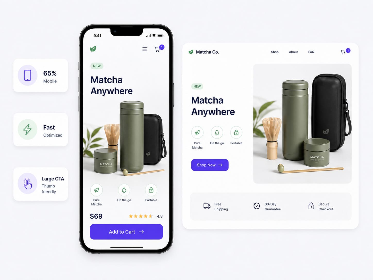
The mobile device now drives roughly 65% of landing page traffic, yet it converts below desktop — HubSpot's 2026 data pegs the average mobile landing page at 2.8% versus 4.8% on desktop. That gap is an opportunity, not a fact of life: among top-performing pages, 86% are optimized for mobile.
Design for the small screen first — large tap targets, thumb-reachable buttons, legible type, and forms painless to complete on a phone. In categories like food delivery, where the mobile moment matches buying intent, the gap nearly disappears precisely because the experience is built mobile-first.
6. Lead with a clear value proposition and strong headline
Visitors decide in seconds whether to stay, so your hero section has to earn the visitor's attention fast. It needs an attention grabbing headline stating the single main benefit, a supporting subhead, and ideally three value propositions answering "What's in it for me?" Use short paragraphs and scannable bullet points rather than dense text — users skim landing pages, they don't read them. Lead with the benefit, not the feature, and make the value impossible to miss above the fold.
7. Guide the eye with visual hierarchy and white space
How you arrange the other elements is as important as what they say. Use established reading patterns — an F-pattern layout for text-heavy pages, a Z-pattern for simpler visual ones — to place your headline, hero image, key benefits, and CTA where eyes naturally travel.
Give important elements room with generous white space, which lowers the perceived effort of taking in the page and keeps a clean layout from overwhelming visitors. A simple design with one clear focal point and a minimal layout almost always beats a busy one, whether you favor a bright or dark background.
8. Add social proof near your decision points
Trust converts, and proof of trust converts better. Testimonials, customer logos, ratings, and success stories reassure potential customers in the consideration phase, right as they weigh the action.
The research is strong: Spiegel Research Center found that displaying reviews can lift conversion substantially, with the effect most pronounced once a product has five or more reviews. Place social proof close to your CTA and form — where doubt creeps in — not buried at the bottom.
9. Cut your form fields ruthlessly
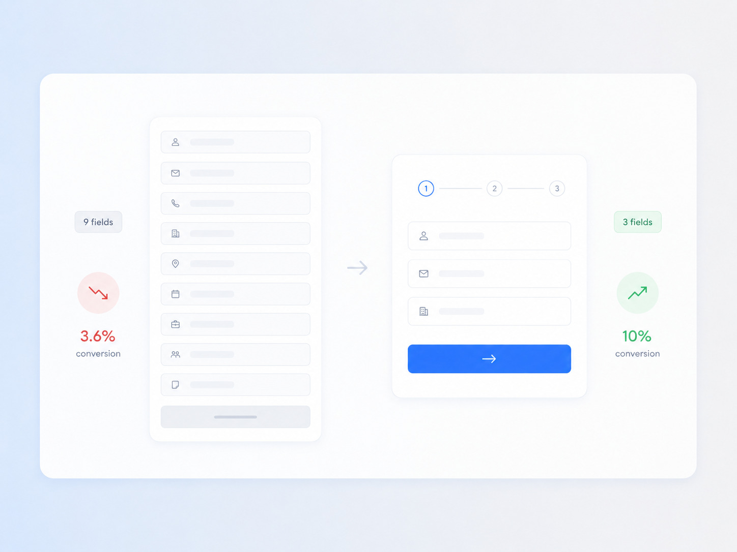
Every field you ask for costs you conversions. Unbounce's 2026 benchmark data found three-field forms convert at about 10% while nine-field forms drop to 3.6%, and form complexity is the top cited reason for mobile abandonment.
For lead capture, ask only for what you truly need for first contact — collect the rest later. For longer lead generation, multi-step forms that break the ask into small stages consistently beat a single wall of fields, so favor shorter forms wherever possible.
10. Write one focused, benefit-driven call to action
Decide on a single desired action and make the CTA unmistakable. Use specific, first-person, benefit-oriented button copy ("Get my free plan") over generic verbs ("Submit"), and be deliberate about CTA placement — repeated naturally down a long form page so the action stays within reach as visitors scroll.
Personalized CTAs that adapt to the visitor have been shown to outperform generic ones by 202%, so segment and tailor wherever you can. This is the element that most directly drives conversions, so it deserves the most testing.
11. Personalize the offer, not just the CTA
Customers can sense a generic offer. Instead of the default 10–15% off, give people a genuinely valuable reason to act — tailored to their industry, their pain points, or the segment that brought them.
This extends to the whole page: the messaging, images, and core message should reflect who's actually landing. Dynamic, personalized pages have been shown to convert meaningfully more mobile visitors than static one-size-fits-all pages, which encourages visitors to act because the offer reads as a fit rather than a discount.
12. Build multiple landing pages and test relentlessly
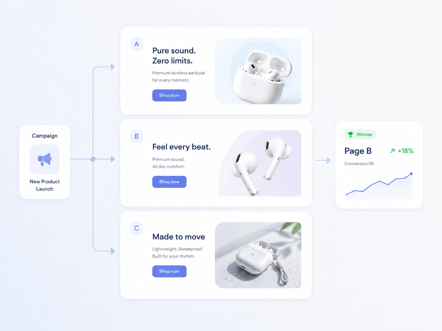
One page is a guess; many pages are a strategy. Creating a dedicated landing page for each campaign lets you match messaging to each target audience and control each campaign's objective — and the payoff scales. Companies that grow from around 10 to 40+ landing pages see dramatic increases in leads. Pair that with disciplined A/B testing: test one element at a time — headline, hero image, CTA, form length — and keep only proven winners.
Only about one in eight tests produces a clear winner, so continuous iteration, not a single test, is what compounds landing page performance. A funnel that lets you spin up and split-test pages built with Funnelish quickly turns this from a chore into a repeatable advantage, and reviewing strong landing page inspiration from others in your space is a useful starting point for what to test next.
Bringing it together
A great landing page in 2026 isn't about flashy design — it's ruthless focus plus a fast, frictionless experience. Match your message to the ad, lead with a clear value proposition, prove trustworthiness with social proof, strip forms and navigation to the essentials, and obsess over speed and the mobile device. Then make every page a test you learn from. Do that, and your landing page stops being a leaky first impression and becomes the most reliable conversion engine your site owns.
Table of contents
Boost your eCommerce
sales today

24/7 support
No credit card required
Cancel anytime
24/7 support
No credit card required
Cancel anytime
