

Shopify
10 Shopify Product Page Mistakes That Are Killing Your Conversions
29 May 2026
Kawtar
11 minutes

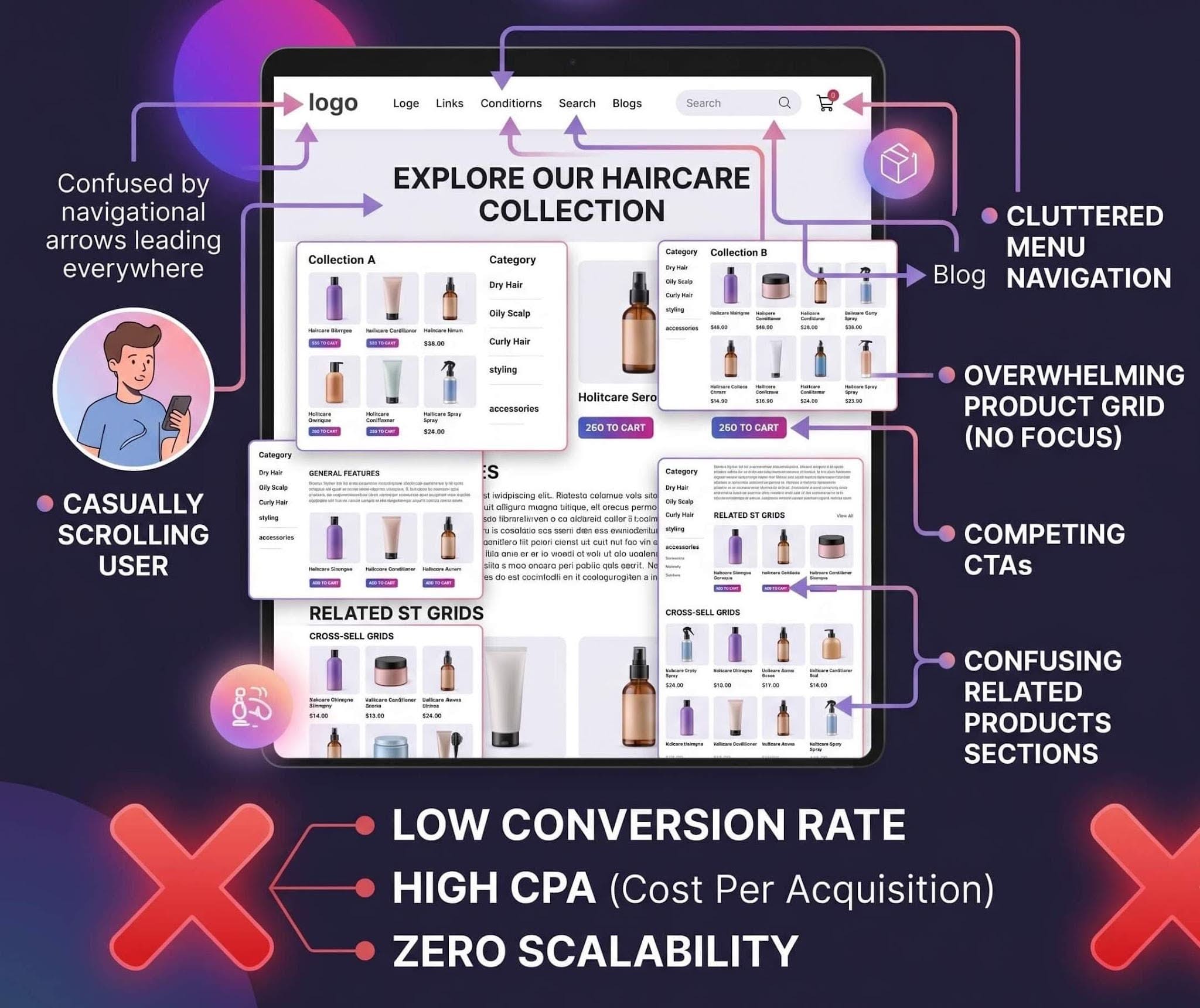
This is how most Shopify product pages actually feel to users — cluttered, overwhelming, and difficult to navigate.
Instead of asking “How do I get more traffic?”, most Shopify store owners trying to increase their conversion rate are asking the wrong question.
Why is my Shopify product page not converting?
Because the truth is…
Most Shopify product pages don’t fail because of bad products or weak ads.
They fail in the first few seconds — when a visitor lands, looks around, and silently decides:
“This isn’t convincing enough.”
No scroll.
No engagement.
No purchase.
What Most Shopify Product Pages Get Wrong
Most Shopify product pages are built to display products.
They show:
Images
Price
Description
Add to cart
But they don’t guide the user through a decision.
That’s the real problem.
High-converting product pages don’t just show information — they structure it in a way that reduces hesitation and builds trust step by step.
This is where many standard Shopify pages fall short.
1. Low-Quality or Unclear Product Images
Generic product images vs real-life usage — one builds trust, the other creates doubt.
2. Weak or Generic Product Descriptions
Most Shopify product pages don’t fail because of bad products — they fail because the description doesn’t sell.
A generic product description only tells the visitor what the product is.
A high-converting product description explains why it matters.
And that’s the difference between a visitor scrolling… and a customer buying.
Think about it.
When someone lands on your Shopify product page, they’re not looking for specifications — they’re looking for a reason to trust you, a reason to care, and a reason to take action.
But most store owners do this:
Bad example (generic Shopify description):
“High-quality cotton t-shirt. Comfortable and durable. Available in multiple sizes.”
This doesn’t create desire.
It doesn’t solve a problem.
It doesn’t move the user closer to purchase.
Now compare it with this:
Better (conversion-focused description):
“Stay comfortable all day with this ultra-soft cotton t-shirt designed to keep its shape even after 50+ washes — no shrinking, no fading, just a perfect fit every time.”
Same product.
Completely different impact.
At Funnelish, we’ve seen that product pages that focus on benefits, clarity, and real-life outcomes consistently outperform those that rely on generic descriptions.
Because in the end, people don’t buy products.
They buy outcomes.
Fix it:
Focus on benefits, not just features
Answer: “What’s in it for me?”
Use simple, clear, persuasive language
Add specific details (proof, numbers, results)
Make every sentence push the user closer to clicking “Add to Cart”
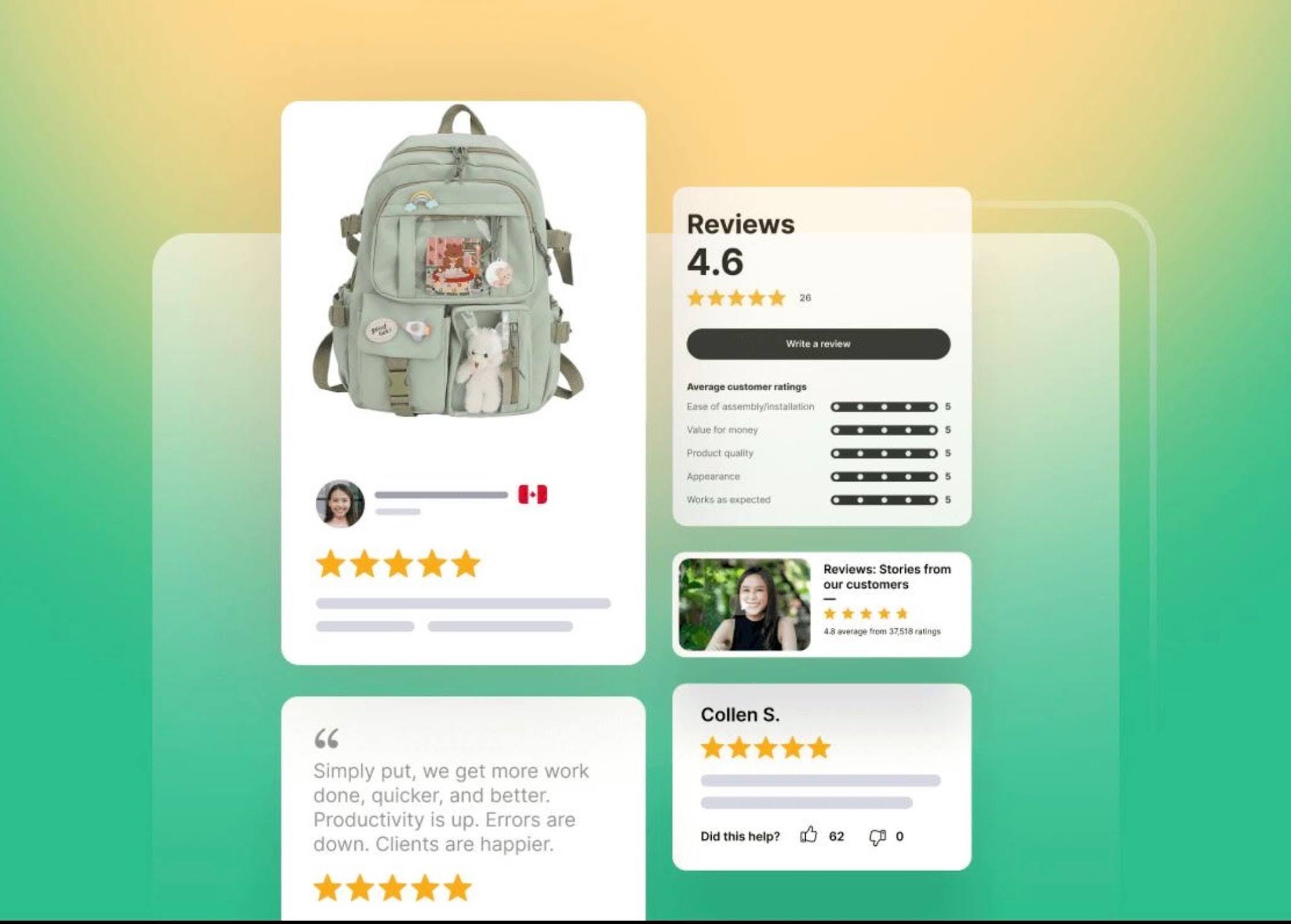
3. Lack of Social Proof (Reviews & Testimonials)
People don’t trust your product.
They trust other people.
And this is where most Shopify product pages fail — they try to sell without proving anything.
When a visitor lands on your product page, they’re asking one question:
“Has anyone else actually bought this… and was it worth it?”
If your page doesn’t answer that instantly, you lose trust.
And when trust is gone… conversions drop.
Most Shopify stores either:
Have no reviews at all
Show fake-looking testimonials
Or hide reviews at the bottom where no one sees them
And that’s a huge mistake.
Because social proof is not just “nice to have” — it’s often the deciding factor between a sale and a bounce.
At Funnelish, internal data shows that product pages with visible, authentic social proof consistently convert higher than those without it.
Not just a little.
Significantly.
Because when users see others buying, using, and loving the product… it removes doubt instantly.
What high-converting pages do differently:
Show real customer reviews with photos
Highlight ratings near the CTA (Add to Cart)
Include user-generated content (UGC)
Use before/after results when possible
Display number of customers or orders (e.g. “1,200+ sold”)
Fix it:
Add reviews directly under the product title or price
Use real photos/videos from customers
Avoid generic testimonials like “Great product!”
Make social proof visible without scrolling too much
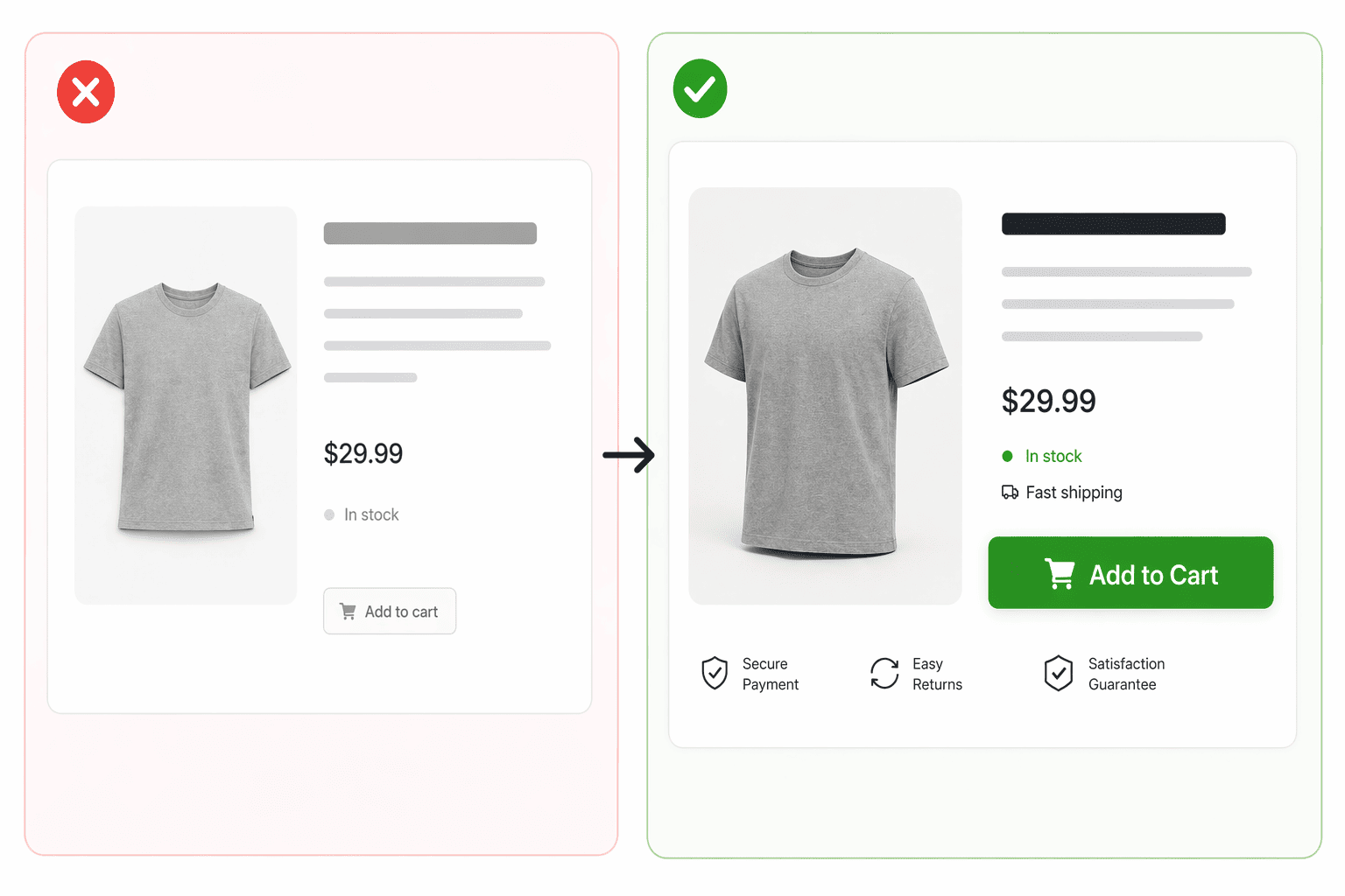
4. No Clear or Compelling Call-to-Action
If your Shopify product page is not converting, one of the most common reasons is a weak or unclear call-to-action.
You can have a great product.
Strong images.
Persuasive descriptions.
But if users don’t know exactly what to do next…
They won’t do anything.
No clicks.
No add to cart.
No sales.
Most Shopify product pages make one of these mistakes:
The “Add to Cart” button is hard to find
The CTA looks weak or generic
There are too many competing actions
The button doesn’t stand out visually
And when users hesitate…
They leave.
A clear call-to-action is one of the most important factors in improving Shopify conversion rates.
Because clarity removes friction.
And when the next step is obvious…
Users act.
At Funnelish, we’ve seen that pages with strong, visible CTAs consistently outperform those with weak or confusing ones — especially on mobile.
What high-converting product pages do differently:
Use one clear primary CTA (e.g. “Add to Cart”)
Make the button large, visible, and easy to tap
Use high-contrast colors that stand out
Place the CTA above the fold and repeat it
Remove distractions around the button
Add microcopy that reduces hesitation (e.g. “Free Shipping”, “30-Day Guarantee”)
Want to see how better CTAs increase conversion rates on Shopify product pages?
5. Slow Page Loading Speed
Speed isn’t just a technical detail — it’s a conversion factor.
If your Shopify product page takes too long to load, users won’t wait. They leave.
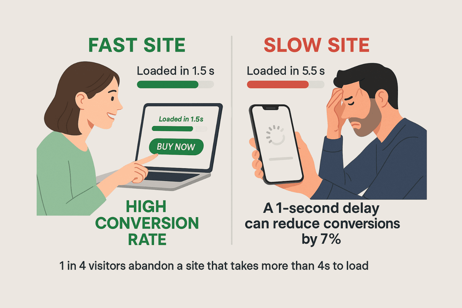
Fast vs slow Shopify product pages — even a 1-second delay can significantly reduce conversion rates.
Even a delay of a few seconds can significantly reduce your conversion rate, especially on mobile.
Because in eCommerce, attention is fragile.
A slow page doesn’t just feel annoying — it feels untrustworthy.
And when a page feels broken or unreliable, users hesitate… or bounce.
At Funnelish, we’ve seen that faster-loading product pages consistently outperform slower ones — often without changing anything else on the page.
Because speed creates momentum.
And momentum drives action.
What high-converting pages do differently:
Optimize images (compressed, properly sized)
Reduce unnecessary apps and scripts
Use lightweight, fast-loading layouts
Enable lazy loading for images and media
Avoid heavy animations that slow down the page
6. Poor Mobile Optimization
If your Shopify product page is not optimized for mobile, you’re losing a huge number of potential customers.
Today, most traffic comes from mobile devices — yet many product pages are still designed with desktop in mind.
What looks clean and structured on desktop often becomes cluttered, slow, and frustrating on smaller screens.
And when the experience feels difficult…
Users don’t stay. They leave.
In reality, poor mobile optimization is one of the biggest reasons why Shopify product pages fail to convert.
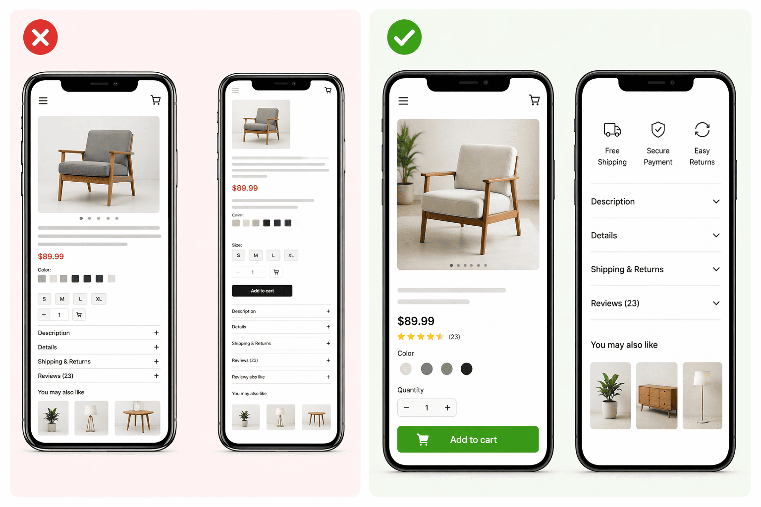
Mobile-optimized Shopify product pages improve conversion rates, boost user experience (UX), and reduce bounce rate — while poor mobile optimization leads to lost sales
Because on mobile, every detail matters:
Buttons that are too small or too close together
Text that’s hard to read
Images that don’t load properly
Sections that feel overwhelming or disorganized
These small issues quickly add up and create friction.
At Funnelish, we’ve seen that optimizing product pages for mobile can significantly improve conversion rates — sometimes more than any other change.
Because on mobile:
Simplicity wins.
Speed wins.
Clarity wins.
What high-converting mobile product pages do differently:
Use large, easy-to-tap buttons
Keep layouts simple and vertically structured
Optimize images for fast loading
Place the CTA early and repeat it
Reduce unnecessary sections and distractions
Ensure a smooth, fast checkout experience
7. Too Many Distractions on the Page
When a visitor lands on your Shopify product page, their attention is limited.
Every extra element…
Every unnecessary section…
Every competing message…
👉 Pulls them away from one goal:
Buying the product.
Most Shopify stores make this mistake:
Too many popups
Too many banners
Too many links
Too many “offers” at once
Instead of helping the user…
They overwhelm them.
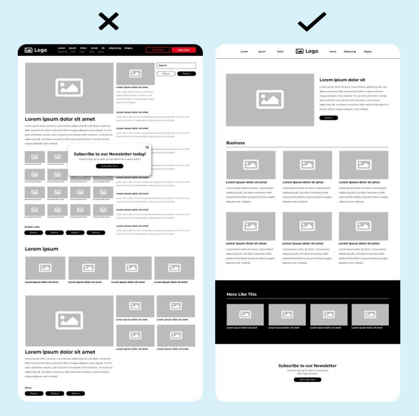
Distraction-free Shopify product pages improve user experience, reduce bounce rate, and increase conversion rates.
And when users feel overwhelmed…
They don’t decide.
They hesitate.
They leave.
Why this kills conversions:
Because confusion creates friction.
And friction kills sales.
What high-converting Shopify pages do differently:
Focus on one clear goal (conversion)
Remove unnecessary sections and clutter
Limit navigation options during the buying process
Keep the layout clean and distraction-free
Guide the user step-by-step toward the CTA
🧠 Pro insight (SEO + persuasion):
At Funnelish, we’ve seen that simplifying product pages and removing distractions can significantly increase conversion rates — especially on mobile.
Because when the path is clear…
👉 Users follow it.
8. No Urgency or Scarcity Elements (Shopify Conversion Killer)
One of the biggest reasons why Shopify product pages don’t convert…
Is simple:
No urgency.
No scarcity.
When users visit your Shopify product page…
They don’t feel any pressure to buy.
They think:
“I’ll come back later.”
But in ecommerce…
“Later” = never.
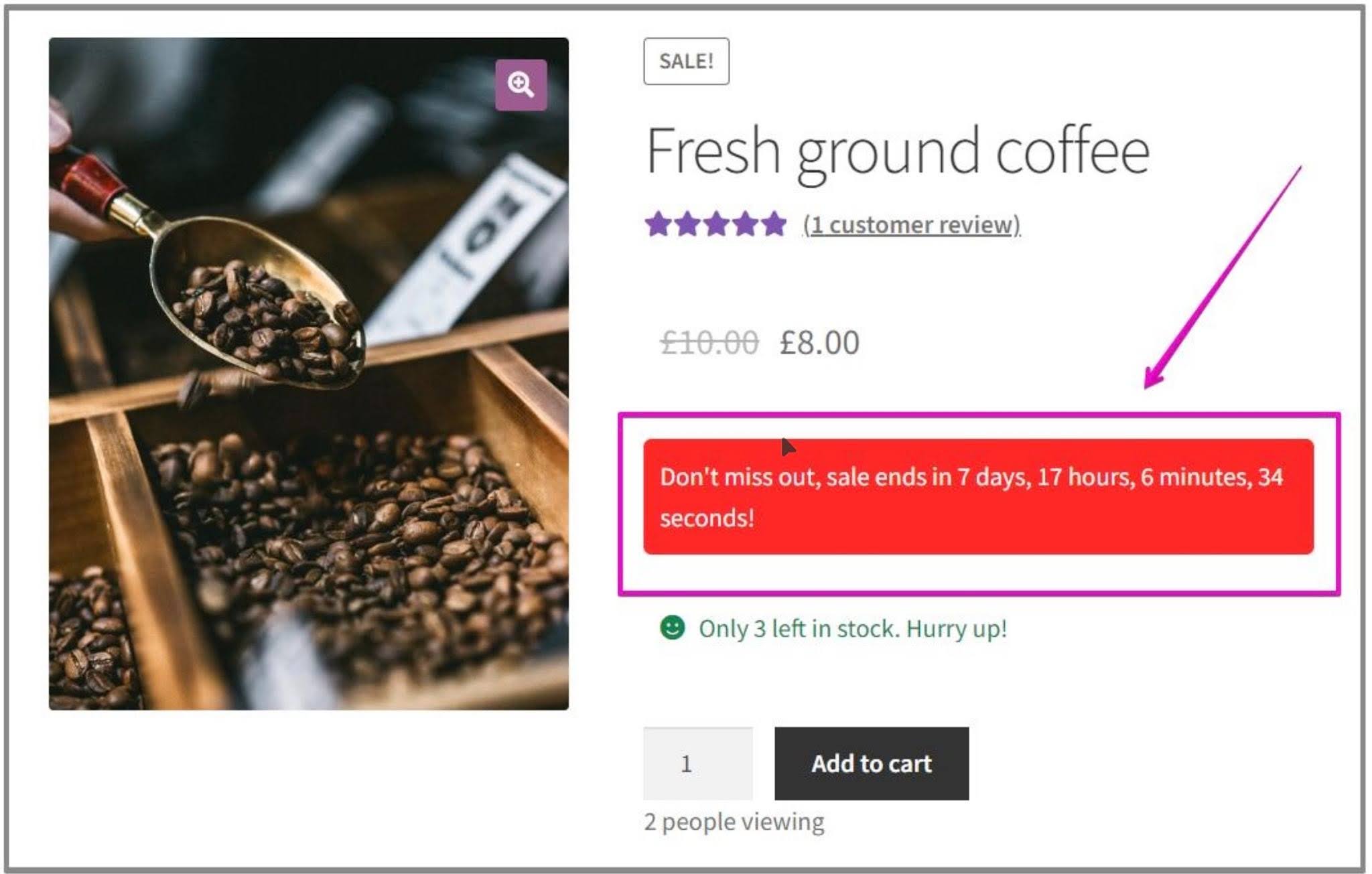
Shopify product pages with urgency elements like countdown timers and low stock alerts can significantly increase conversion rates and reduce cart abandonment.
Why lack of urgency kills Shopify conversions:
If your product page doesn’t create urgency:
Users delay the purchase
They compare other stores
They forget your product
They never come back
Result: low conversion rate on Shopify
Common Shopify mistakes:
No limited-time offers
No low stock alerts
No countdown timers
No scarcity messaging
Everything feels unlimited.
And when something feels unlimited…
👉 It feels less valuable.
How high-converting Shopify product pages use urgency:
Add “Only X items left in stock”
Use countdown timers for discounts
Show “Selling fast” badges
Create limited-time offers
Highlight flash sales or expiring deals
Pro insight (Funnelish data):
At Funnelish, we’ve seen that adding urgency and scarcity elements to Shopify product pages can significantly increase conversion rates by reducing hesitation and pushing users to take action faster.
Because in ecommerce:
👉 Urgency drives action
👉Scarcity increases perceived value
9. Confusing or Unclear Pricing (Shopify Conversion Killer)
If your Shopify product page pricing isn’t clear…
You’re losing sales.
Because pricing is not just a number.
It’s a trust signal.
When users see your price, they instantly ask:
“Is this the final cost?”
“Are there hidden fees?”
“Why is this discounted?”
And if there’s any doubt…
They don’t buy.
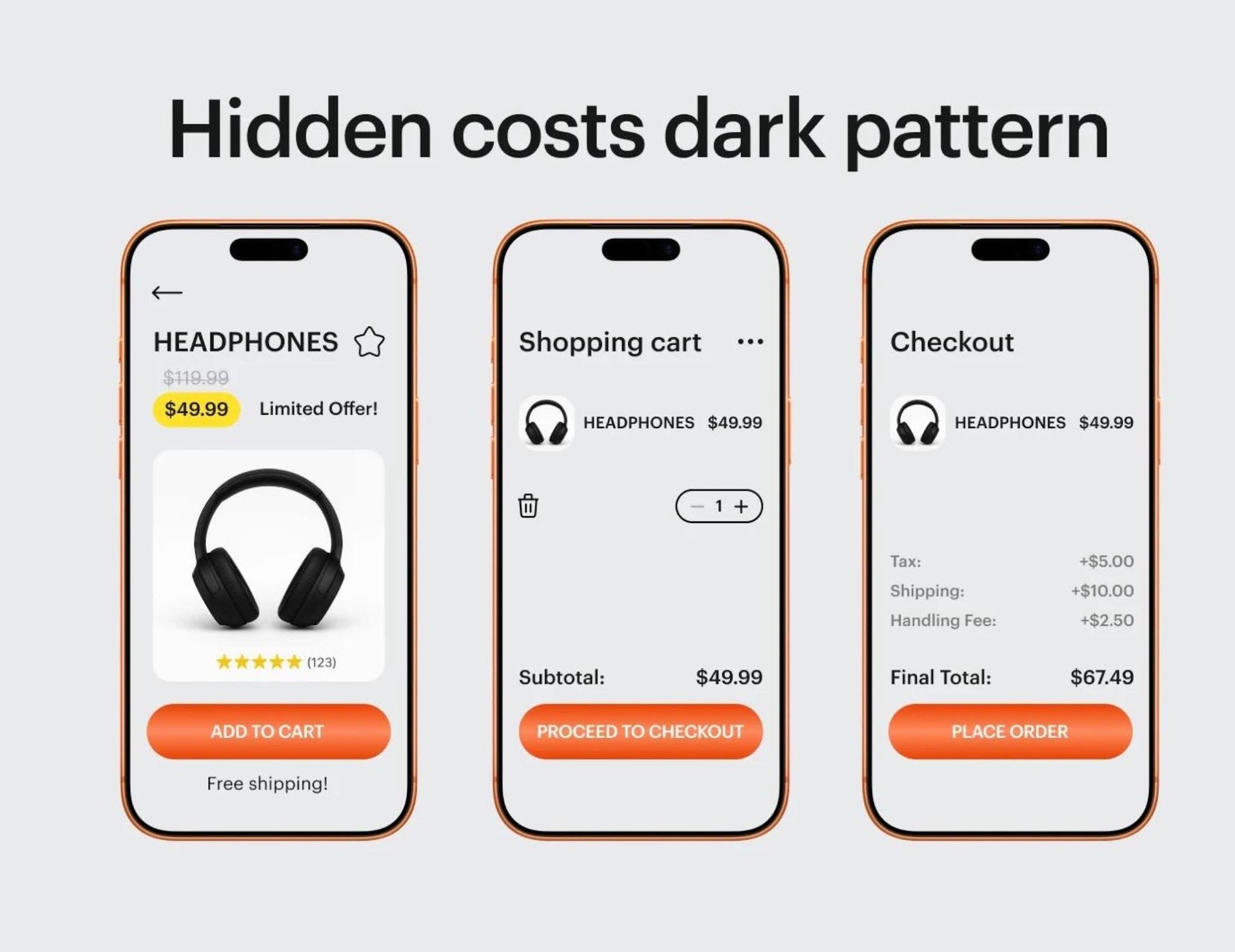
👉 What starts as a $49 product can quickly turn into $67 — and that’s where most customers drop off.
Hidden costs on Shopify product pages — like unexpected taxes, shipping fees, or extra charges at checkout — instantly break trust.
And when trust is broken, conversion rates drop fast — especially on Shopify product pages. That’s why unclear pricing is one of the biggest causes of cart abandonment.
Why unclear pricing destroys conversion rates:
Unclear pricing creates hesitation.
Hesitation creates friction.
And friction kills conversions.
Even small issues can hurt your Shopify conversion rate:
Hidden shipping costs
Unclear or fake-looking discounts
Multiple prices with no explanation
Missing currency or taxes
No visible value for the price
The result? Users lose trust and leave.
🔥 What high-converting Shopify product pages do differently:
Show clear, final pricing upfront (no surprises at checkout)
Display original price vs discounted price clearly
Highlight savings (e.g. “Save 40%”)
Add free shipping or delivery info near the price
Reinforce the value behind the price (what the user gets)
Pro insight (conversion + SEO):
At Funnelish, we’ve seen that transparent pricing on Shopify product pages can dramatically increase conversion rates — especially when combined with urgency and trust signals.
Because when pricing is clear…
Users feel confident.
Users feel safe.
👉 Users buy.
If you want to eliminate hidden costs, improve pricing clarity, and increase your Shopify conversion rates, tools like Funnelish can help you build optimized, high-converting funnels without the usual friction.
Learn more here: https://funnelish.com
10. Missing Trust Signals (Guarantees, Badges, Policies)
If your Shopify product page looks good…
But still doesn’t convert…
👉 One of the biggest reasons is simple:
People don’t trust you enough.
Because online, customers can’t touch your product.
They can’t talk to you.
So they ask themselves:
"Is this store legit?"
"Will I actually receive my order?"
"What if I don’t like the product?"
And if they don’t find clear answers…
👉 They leave.
Why trust signals matter for conversion:
Trust reduces risk.
And when risk feels high…
Users hesitate.
They abandon.
That’s why high-converting Shopify product pages always include visible, reassuring trust elements.
What high-converting pages do differently:
Display secure payment badges (Visa, Mastercard, PayPal)
Show clear return & refund policies
Highlight money-back guarantees (e.g. 30-day guarantee)
Include real customer reviews with photos
Add shipping information upfront (delivery time, tracking)
Show contact details or support availability
👉 These elements tell the customer:
“You’re safe here.”
Customer reviews and ratings build trust and increase Shopify product page conversion rates by reducing buyer hesitation.
Together, these trust signals remove doubt and make customers feel confident to complete their purchase.
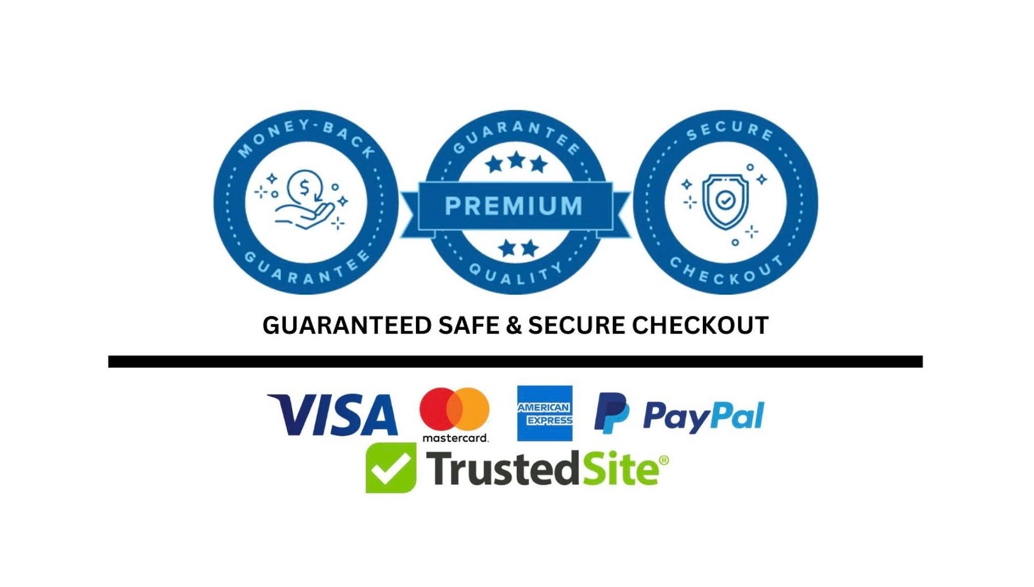
Secure payment badges, guarantees, and clear policies reduce friction and improve Shopify checkout conversion rates.
Without these elements, even great products struggle to convert.
Real impact:
A simple guarantee or trust badge can be the difference between:
❌ “I’m not sure…”
❌ “Is this store legit?”
❌ “What if something goes wrong?”
✅ “This looks trustworthy.”
✅ “I feel safe buying here.”
✅ “Let’s checkout.”
🚀 Final Thoughts
A high-converting Shopify product page isn’t just about how it looks — it’s about how it feels to the customer.
When your page is clear, transparent, and built on trust…
Customers don’t hesitate. They buy.
But when there’s confusion — hidden costs, no reviews, no guarantees — even the best products struggle to convert.
That’s why optimizing your Shopify product page for clarity, trust, and user experience is no longer optional — it’s essential for improving conversion rates and reducing cart abandonment.
👉 Want to build Shopify product pages that actually convert?
At Funnelish, we’ve analyzed thousands of funnels and found that pages with:
✔ Clear pricing (no surprises)
✔ Strong trust signals (reviews, guarantees, badges)
✔ Simple, distraction-free design
consistently generate higher conversion rates than standard Shopify pages.
If you want to build pages that don’t just look good — but sell — Funnelish gives you the tools to do it faster and better.
👉 Start building high-converting Shopify pages with Funnelish
Table of contents
Boost your eCommerce
sales today

24/7 support
No credit card required
Cancel anytime
24/7 support
No credit card required
Cancel anytime
