

Ecommerce Website Design: Build It Around the Funnel
05 September 2026
Anna P.
12 minutes
Design your ecommerce website as a path with one exit. A catalog invites browsing; a funnel walks somebody toward a purchase. That means a home page for people who searched your name, a landing page built for one product that takes your ad traffic, a checkout offering two or three price tiers, an upsell after payment, a downsell for anyone who says no, and a thank you page that starts the next order. Keep the look conventional while you're at it. Research published in 2025 found that commercial sites score better when they follow the design conventions people expect, so save your creativity for the photography and the copy.
You'll find a hundred galleries of the best ecommerce websites, and hardly any of them tell you what to build. They show you a beautiful home page and leave you guessing about everything between that page and someone's card details. Those examples work as inspiration and fail as instructions. So let's go the other way and walk a working funnel, page by page, using a luxury jewelry template that sells an 18K gold-plated necklace.
Build a Path Through the Site
Here's the mistake first ecommerce sites keep making. Someone builds a home page, starts to add products, wires up a menu, and hopes visitors find their own way to a purchase. That's a shop window. It works when people already know you and browse on purpose.
Ad traffic behaves differently. Somebody taps an ad about a gold necklace, and they want that necklace, right now, with no detour through your collections page. Online shoppers arriving that way have already decided. Give them a menu and you've handed them five ways to leave.
So the funnel approach flips the job. Each page in your ecommerce website design does one thing and hands the visitor to the next. Fewer choices, one road, and a number you can measure at every step of the customer journey. That's the whole business case for building your online store this way.
Your Site Should Look Like What People Expect
This part surprises people, and it's the most useful research on web design to land in years.
Kathrin Figl, Aliaksei Miniukovich, Christiane Ernst and Christiane Lehrer ran an online experiment on how closely a page follows the design conventions of its category, which they call prototypicality. Navigation in the usual place, familiar layout, expected color logic. They found that pages matching the conventions of their genre produced significantly better attitudes toward the organization behind them. Looking normal made people think better of the brand.
A second team went further and split the question. Johanna Silvennoinen, Jemina Kotkajuuri and Tuomo Kujala asked 108 people to rate novelty, typicality and appeal across twelve sites, testing the old design rule that the best work is the most advanced yet acceptable. Novelty and typicality both predicted appeal, but they didn't fall evenly. Novelty mattered more for service websites, while typicality mattered more for commercial ones.
Read that last part again if you sell things. On commercial ecommerce sites, the familiar layout does more work than the clever one. Those inspirational design galleries are stuffed with award-winning agency portfolios, and copying their tricks onto a store is a good way to lose money. Put your originality into product photography, copy and brand identity. Leave the cart icon in the top right where everybody's hand already goes. Most best UX practices are just conventions people have already learned, and you get them free.
Walk the Funnel Page by Page
Enough theory. Here's the jewelry funnel, in the order a buyer meets it.
Home Page
The home page carries the brand and catches people who searched your name. This one leads with "Timeless 18K Gold-Plated Heart Necklace" over the line "Affordable Luxury for Everyday Elegance," a model shot, and the price stated plainly: $106.25 against a $125 retail price, marked 15% off.
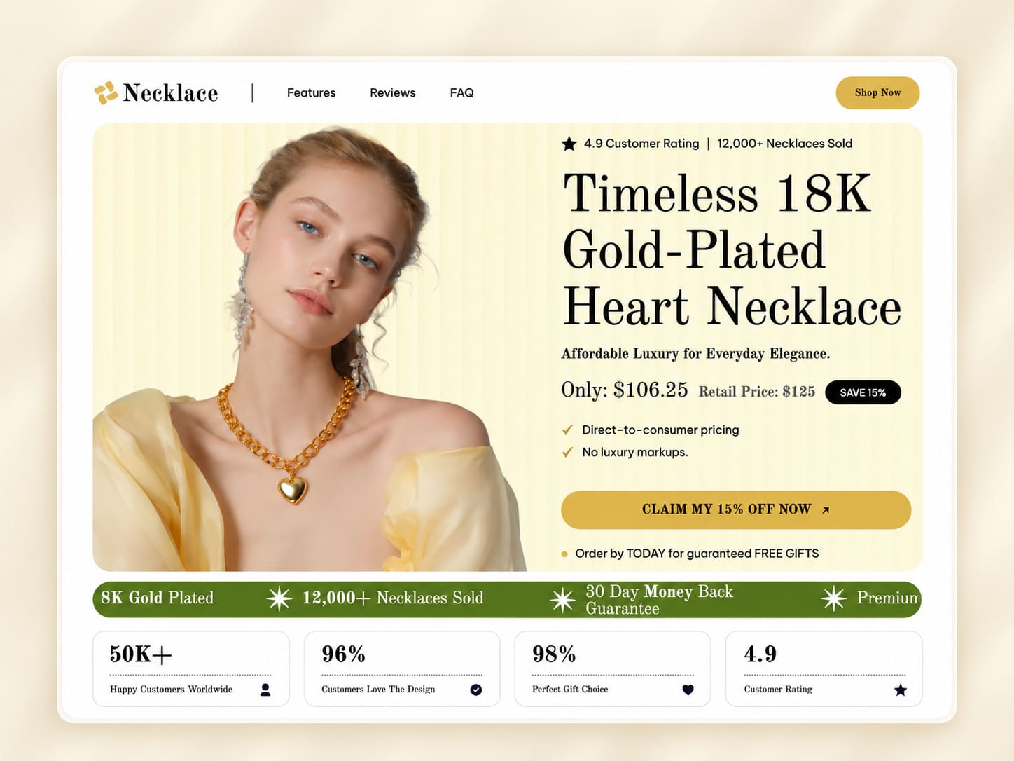
Two claims run underneath, and they're doing real work: direct-to-consumer pricing, and no luxury markups. That's how you justify competitive pricing on a product people expect to cost more. A 4.9 rating and 12,000 necklaces sold run along the top. Navigation stays short at Features, Reviews and FAQ, plus one Shop Now button.
Notice what's missing. No mega-menu, no eleven categories, no carousel. Clear navigation on a single product store means three links and a button. You can always add products later and grow the menu when you've earned it.
Landing Page
Your ads point here, and this page works harder than any other. It opens with a countdown, then "The Last Gold Necklace Your Skin Will Ever Love," which promises a benefit rather than describing an object.
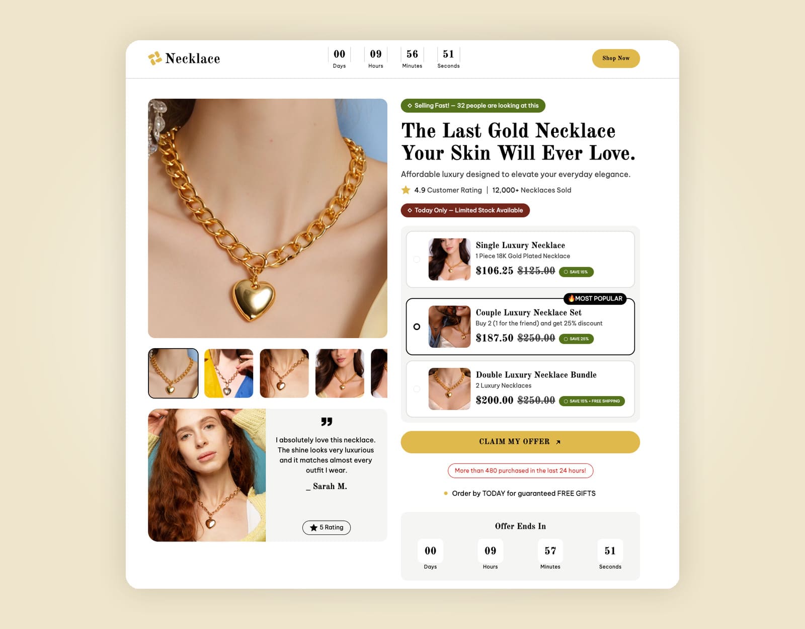
Around it you'll find the pressure signals: 32 people looking right now, limited stock today only, the same 4.9 rating and 12,000 sold. Then the offer, priced identically to the home page at $106.25 from $125.
Use these honestly. A countdown that resets every time somebody reloads teaches people your deadlines are decoration, and they'll remember that at checkout. Scarcity you can't back up costs you more than it earns.
Checkout Page
At this stage, the money changes shape. Rather than one product and one price, the checkout offers three tiers.
Option | Price | Retail | Saving |
Single Luxury Necklace | $106.25 | $125.00 | 15% |
Couple Luxury Necklace Set, marked Most Popular | $187.50 | $250.00 | 25% |
Double Luxury Necklace Bundle | $200.00 | $250.00 | 20% |
The middle option earns its label. Buy two, keep one, give one away, and the discount climbs from 15% to 25%. Per necklace that's $93.75 against $106.25, so the buyer saves 11.8% a piece while your order value climbs 76.5%. Both of you come out ahead. That's the only kind of upsell that survives contact with a refund policy.
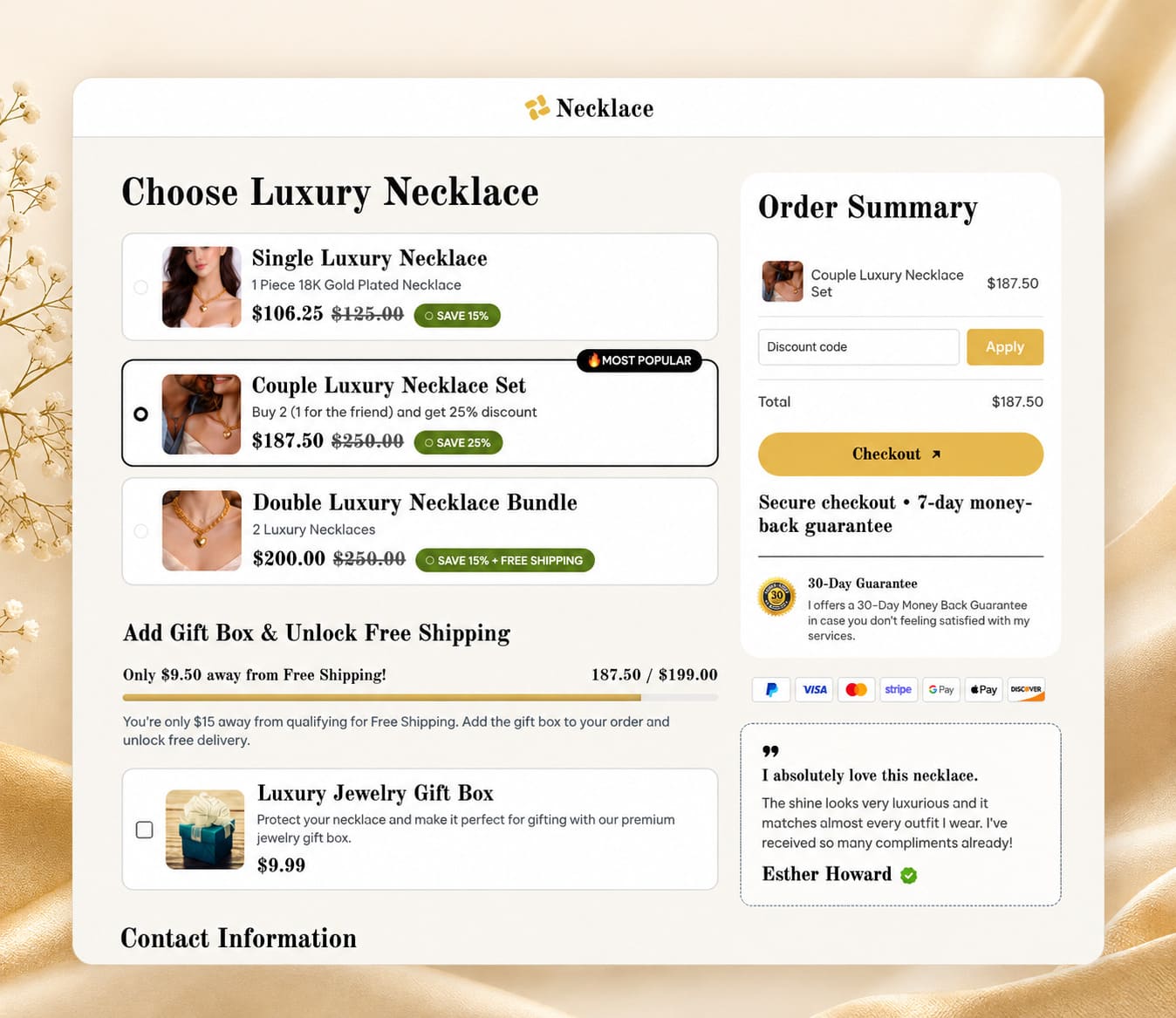
The order summary stays visible beside the form with a discount code field and the total. Underneath runs the line that matters most on this page: secure checkout, seven-day money-back guarantee.
Upsell Page
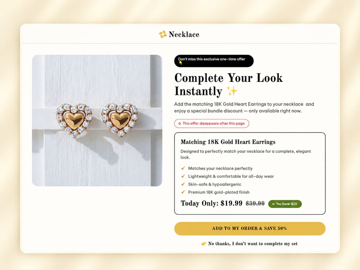
After payment, the buyer meets matching 18K gold heart earrings at a bundle discount, under the heading "Complete Your Look Instantly" and a note that the offer disappears with the page.
Post-purchase upsells work because the hard part already happened. They've trusted you, their card details are stored, and accepting takes one tap. Model it and the leverage shows: earrings at $49 taken by 12% of buyers adds $5,880 for every 1,000 orders, and you spent nothing extra on marketing to earn it.
Read more: Upselling Techniques: Digital Upsells + Physical Products for Margins You Actually Keep
Downsell Page
Decline the earrings and you get "WAIT! Before You Go... Here's a Better Option for You," then the same earrings at a lower price with no bundle required.
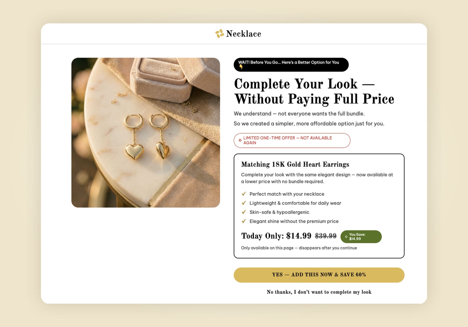
The copy does something worth stealing. It opens by admitting the full bundle won't suit everybody. That names the objection instead of arguing with it. Plenty of funnels skip this page and leave the money on it.
Thank You Page
The confirmation shows an order number, a note that the order ships within 24 hours, and beside it an offer of 10% off the next order that expires in 24 hours, plus social share buttons.
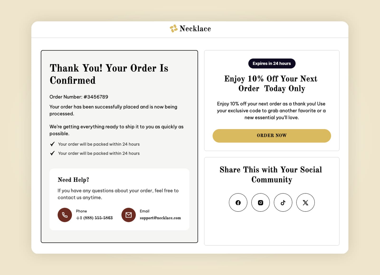
Treat this page as the start of the next sale. If 8% of buyers redeem that code on a $187.50 order, you've added $13,500 per 1,000 customers from a page plenty of stores waste on a receipt.
Terms of Service and Privacy Policy
Both carry a January 2026 update date. They look like housekeeping until a payment provider reviews your account, because they'll check for both before approving you. Store policies people can reach in one click also settle nerves that no amount of design will.
Try the Free Luxury Jewelry Funnel Template
This funnel is free to use, and it arrives wired together in order: home page, landing page with countdown, three-tier checkout, post-purchase upsell, downsell, thank you page with the repeat-order offer, and both policy pages.
Get the Free Jewelry Funnel Template
Page | What it does |
Home page | Brand traffic, 4.9 rating, 12,000 sold, three nav links |
Landing page | Countdown, live viewer count, one offer at $106.25 |
Checkout | Three tiers from $106.25 to $187.50, guarantee under the button |
Upsell | Matching earrings at a bundle price, one tap |
Downsell | Same earrings, lower price, no bundle |
Thank you page | Order status plus 10% off the next order |
Terms and privacy | What payment providers check before approving you |
Swap the photos, prices and copy in the page builder and the jewelry brand turns into yours in an afternoon. Templates like this one save you the part that takes longest, since you're borrowing a structure somebody already tested. Style it however your brand needs.
Speed, and the Strange Thing About Loading Animations
Everyone tells you to make the site fast. Fewer people can tell you what fast is worth.
Deloitte and Google ran the numbers across retail, travel and luxury brands in Europe and the US over four weeks. Improving mobile site speed by a tenth of a second lifted retail conversions 8.4% and average order value 9.2%. Luxury brands saw page views per session climb 8.6%. A tenth of a second.
Then there's something nobody expects. Yu Ding and Ellie Kyung published work in the Journal of Consumer Research on the loading animation itself, and found the relationship curves rather than running straight. Moderate-speed animations made waits feel shorter than no animation, slow animations or fast ones. A spinner racing around signals a long wait to the person watching it. Their effect carried through to click-to-landing rates, conversion rates and how people judged products while shopping on a phone.
What to do: compress your images, keep image sizes disciplined, and if you use a loading animation, set it to a moderate speed rather than the fastest one your theme offers. Speed is one of the few tools where the work is boring and the payoff is measurable.
Product Pages That Answer the Question
A product page has one job: kill the reason somebody hasn't bought yet.
High quality images from several angles, on a model and alone.
Detailed descriptions covering material, dimensions and care.
Both are essential, and skimping on either sends people to a competitor to do the research.
Shipping costs and return policies where people can find them, because hiding either one just moves the abandonment later.
Reviews with names attached.
A visual hierarchy that puts price, promise and button above the fold, then lets everything else follow.
Different categories need different emphasis, and this is where copying another store's layout goes wrong.
Specialty coffee sells on origin, roast date and tasting notes.
Outdoor gear sells on weight, dimensions and weather ratings.
Clothing and t-shirts live or die on the size chart.
Home decor needs scale shots in a real room.
A plastic free water bottle, or any product carrying an environmental claim, needs that claim backed on the page rather than asserted in the footer.
Consumers check these things now, and several factors beyond price decide whether they believe you.
Frequently bought together blocks raise order value when the pairing makes sense, in the way the jewelry funnel puts earrings after a necklace. A pre order option turns a stockout into a sale instead of a lost visitor.
Read more: Best AI Photo Editor for Ecommerce Images in 2026
Checkout Design, Where Most Carts Die
Baymard Institute has tracked cart abandonment for over a decade and puts the average at 70.22% across 50 studies. Their own research on why people quit mid-checkout puts extra costs at the top, named by 40%, then slow delivery at 20% and forced account creation at 18%.
Three of those you can design away this week.
Show costs early. Shipping and tax belong on the product page or in a visible summary, never as a surprise at the payment step.
Offer guest checkout. Making someone create an account before they can pay costs you nearly a fifth of your buyers.
Cut the form down. Ask for what shipping and billing need. Every extra field is another chance to reconsider. Let the billing address default to the shipping one with a checkbox to change it.
Then give people payment options. Cards, wallets like Apple Pay and Google Pay, and whatever local method your market expects. One declined gateway with no alternative is a lost sale that never shows up in your reports as a design problem. Nobody walks out of a shop because the card reader broke in store, but online they close the tab and you never hear about it.
Mobile First, Because That's Where They Are
Most storefront traffic arrives on a phone, so design the mobile layout first and let the desktop version inherit from it. Working the other way around produces a cramped phone experience with easy access to nothing.
Buttons need to be thumb-sized and reachable. Text has to be readable without pinching. Your form should trigger the right keyboard, numeric for the ZIP code and card number. The jewelry checkout keeps its order summary and its guarantee visible on a phone, so the reassurance travels with the buyer instead of scrolling away. Test the real thing on a real handset, because desktop preview lies about how cramped it feels.
Trust Signals and Security
People judge fast. Gitte Lindgaard and colleagues showed that visual appeal gets assessed in about 50 milliseconds, and their ratings at 50 milliseconds matched ratings at 500. That's a finding about looks rather than trustworthiness, though it explains why a dated site struggles before anyone reads a word.
Trust gets built with specifics. Real reviews with names, a visible guarantee, policies you can reach in one click, a working contact method, and HTTPS with a valid certificate. Payment security should meet PCI DSS, and any ecommerce platform worth using handles that for you rather than leaving it to your developer.
The jewelry checkout puts "Secure checkout, seven-day money-back guarantee" directly under the button. That placement is deliberate, because doubt peaks with a card in hand.
Design for Search Engines Too
Your ecommerce website design decides a good chunk of your SEO performance before you write a single description. Search engines read structure.
Give every page one H1 and a sensible heading order.
Write descriptive alt text on your images.
Keep URLs readable.
Make sure product data appears in the HTML rather than only after a script runs, since broken functionality here quietly costs you rankings.
Then connect Google Analytics and watch which pages lose people.
One small thing worth settling early: pick a spelling. Search engines treat an "e-commerce website" and an "ecommerce website" as the same thing, so consistency helps your readers more than it helps your rankings. Whichever you choose, use it everywhere.
What to Check Before You Launch
Run this list against your site.
Check | Why it matters |
Ad traffic lands on a landing page rather than the home page | One path converts better than five |
Layout follows category conventions | Typicality beats novelty on commercial sites |
Price, promise and button above the fold | Visual hierarchy carries the first impression |
Guest checkout available | Forced accounts cost you 18% of buyers |
Shipping costs visible before checkout | Extra costs are the top abandonment reason at 40% |
Mobile layout designed first | That's where the traffic comes from |
Guarantee and security line near the pay button | Doubt peaks with a card in hand |
Upsell after payment, downsell after a decline | Free order value on traffic you bought once |
Thank you page carries the next offer | The cheapest sale you'll ever make |
Work through it in order. Your first step is checking where paid traffic lands, because that single decision moves more revenue than anything else here. Great ecommerce design isn't a look you buy once. You'll keep testing it, and the ideas that survive contact with real buyers are the ones worth keeping.
None of this needs a professional agency or a big budget. It needs a structure that matches how people buy, and the patience to check each page against what it's supposed to do. Get that right and the success shows up in your numbers rather than in a design award.
Table of contents
Boost your eCommerce
sales today

24/7 support
No credit card required
Cancel anytime
24/7 support
No credit card required
Cancel anytime
