

Brand Teardown: How FIGS Turns a $42 Scrub Top Into a $127 Order
25 September 2026
Anna P.
11 minutes
FIGS makes scrubs for nurses, doctors and the rest of the hospital floor, and it sells them direct. It's also a public company. In D2C that's rare: the funnel is out in the open, with the numbers behind it published every quarter.
A Catarina scrub top runs $42. The average FIGS order is $127. We walked the path from the home page to a live checkout with the last two earnings releases open beside us, looking for the $85 in between. Some of what we found you can copy this week. The rest goes on a test list, because nobody outside the company sees its conversion data.
FIGS in 2026: Numbers
Every number here is FIGS's own, filed with the SEC. In the quarter ending June 30, 2026, revenue hit $196.6 million, up 28.8% year over year. Net income reached $28.4 million, against $7.1 million a year before. Both come from its , released on August 6, 2026.
Further down came the funnel numbers. Active customers reached 3.1 million, up 13.2%. Average order value hit $127, up 8.5%. An active customer, in FIGS's , is an account with at least one purchase in the past 12 months.
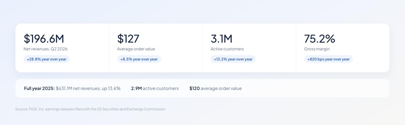
Every figure here comes from filings FIGS has to make. Few D2C brands publish this much.
The math sharpens the picture. At $127 an order, $196.6 million works out to roughly 1.55 million orders. Against that, marketing cost $28.5 million, or about $18 an order. It's higher in reality, because wholesale and team orders inflate our count, though even the floor tells you what a customer is worth to them.
Margin Pays for the Ads
Gross margin reached 75.2% in the quarter, 820 basis points above last year. On a $127 order, that leaves about $95 before marketing. You'll need a cushion like that when you're paying for the second order as well as the first.
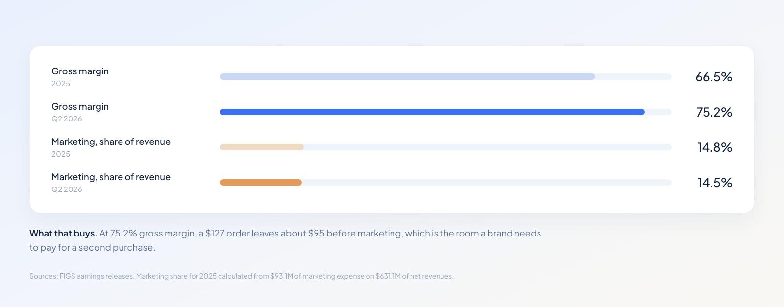
Margin climbed while marketing held near 15% of revenue.
The full year says the same thing. FIGS reported of $631.1 million for 2025, up 13.6%, with 2.9 million active customers and a $120 average order. At $120 an order, 2025 comes to about 5.3 million orders, or 1.8 per customer. That repeat rate is the quiet engine of the model: scrubs wear out, nurses come back.
What's Behind the Storefront?
We expected a Shopify theme with apps bolted on, but the page source said otherwise. FIGS runs a custom Next.js front end on www.wearfigs.com, with Algolia powering the search and Nosto serving the recommendations. Shopify still takes the money, though: click to pay and you'll land on shop.wearfigs.com, on Shopify's own checkout. The site also loads Attentive for SMS, Zendesk for support, Affirm for installments and Global-e for the country switcher.
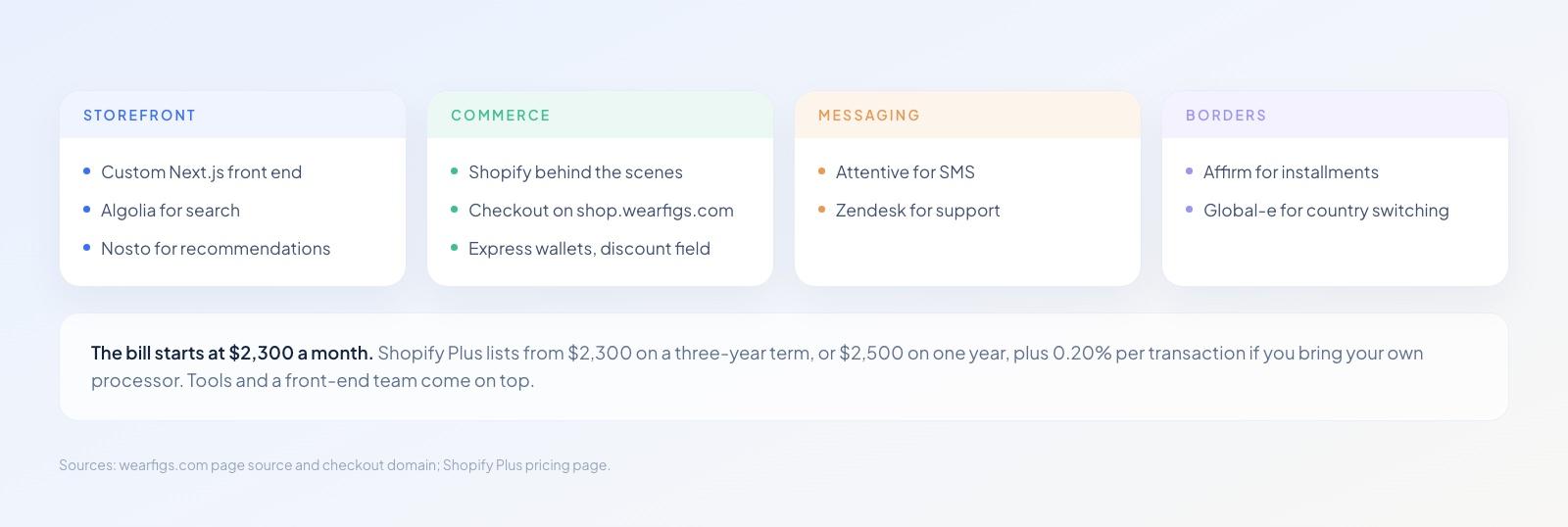
A custom front end, Shopify behind it, and six services around the edges.
What's the Bill?
starts at $2,300 a month on a three-year term, or $2,500 on one year, plus 0.20% per transaction if you bring your own processor. Then, there are the tools and the engineers who keep a custom front end alive. Think you won't match that bill? You don't need to either, because none of it is what makes the funnel work.
FIGS Sales Funnel Page by Page
Here's the route a nurse takes through the site: home page, product page, cart, checkout. At every stop we asked one question. What's FIGS built here, and does the usability research back it?
Home Page
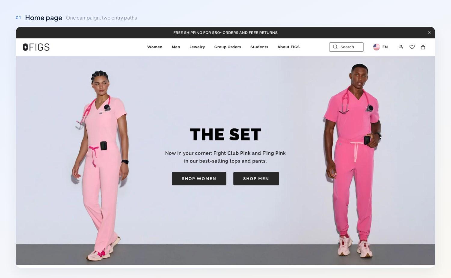
One campaign, two doors into the catalog, and the shipping promise before anything else.
One campaign owns the screen: THE SET, two color names, and a pair of buttons that split traffic into Shop Women and Shop Men. The navigation carries six items. A dismissible bar above the header promises free shipping on orders of $50 or more plus free returns, and it follows you onto every page.
That bar's doing more work than its size suggests. Strip out the window shoppers and extra costs become the top reason a US checkout doesn't finish, named by 48% of the rest in Baymard's . Print the threshold on the first screen and it's old news by the time it turns up in the cart.
No overlay asked for our email before we'd seen a product. Nielsen Norman Group's names ecommerce among the biggest offenders for asking for an address before a visitor has touched the content. It also has people dismissing modal overlays on sight, because they've learned nothing good comes of them.
FIGS gives up some list growth for a clean first screen, and it can afford the trade: there are 3.1 million active accounts already, and Attentive's collecting phone numbers elsewhere. A younger store has a harder call to make, though the timing is what's worth copying. Let people see a product before you ask them for anything.
Product Page
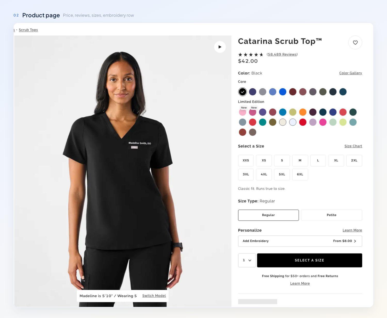
Size, fit, shipping, returns and two paid extras, all inside one buy box.
The Catarina Scrub Top costs $42.00 and carries 58,489 reviews at 4.6 out of 5. Colors split into Core and Limited Edition, with New badges on the fresh ones. Scroll and the page works through the obvious questions: how the top fits, who it fits, what shipping costs, and what happens if you picked wrong.
Eleven sizes, XXS through 6XL, appear as buttons you can read at a glance, with a Regular and Petite toggle below them and a Size Chart link level with the heading. Baymard's has 70% of sites either skipping size buttons or building them wrong, and its testers overlooked the size selector altogether when it came as a dropdown. Until you've picked one, the black button reads SELECT A SIZE.
On the photo, a caption reads "Madeline is 5'10" / Wearing S", and a Switch Model control swaps her for a model built differently. Sizing doubt is what kills apparel carts: Baymard's puts 83% of desktop apparel sites short of the information shoppers need. Its list of ten asks for a size guide link beside the size selector and a set of model measurements. You'll find both here, and the switcher goes past what the list asks for.
Reviews you can't sort are noise, and there are 58,489 of them here. You can narrow them by height, size bought and job, turning a wall of text into a handful of people built like you and doing your work. Elsewhere in the same set of findings, 24% of apparel sites carry no aggregate fit score and 90% give you no way to browse reviewer photos across reviews. FIGS answers the fit question with people. A fit bar would answer it faster for anyone who doesn't want to read.
Under the Add To Bag button comes one small line: "Free Shipping for $50+ orders and Free Returns". Baymard's product page numbers have 43% of sites leaving shipping information off the page while 64% of shoppers look for it there, and 42% skipping any link to a return policy. Both facts land here before the add-to-cart decision instead of surfacing two steps later in a checkout.
The paid extras appear under the size picker, and neither one shouts.
Add Embroidery starts at $8.00 and reads like a product option beside Color and Size.
Complete The Set adds the matching Isabel pant at $58.00 with its own size picker and Add To Bag button, and both items reach the cart without a reload. A matching pant on a scrub top page is about as relevant as a recommendation gets; the harder case waits in the cart.
The set's own page runs a 15% first-order offer, the only discount we came across.
Cart Drawer
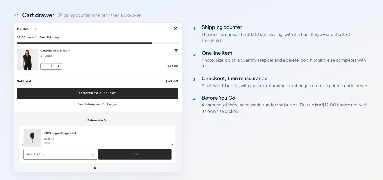
The drawer is the whole cart, and the shipping counter runs along the top of it.
Add the top and a drawer slides in from the right. Nothing lives behind it: the drawer is the cart, and there's no cart page to visit. A page would be the conventional answer. Shoppers treat the cart as a dressing room, parking items they haven't decided on yet, and from NN/g reports mini-carts making comparison harder inside a cramped panel. FIGS took the speed instead. At one or two items the drawer holds up; a nurse restocking six tops in four colors would feel the squeeze.
The top line reads "$8.00 more for Free Shipping!" with a bar filling behind it. Of everything we looked at, this one's got the most research behind it. found shoppers willing to spend extra time and money to clear a threshold. One tester says they'd go back to the catalog because the site told them they were close. The wording is what does the work. FIGS names the $8.00 you still need, while a banner repeating "Free shipping over $50" leaves you to do the subtraction.
Below it come the line item, the subtotal and a full-width checkout button, then a "Free Returns and Exchanges" link. A Before You Go carousel follows, with a $12.00 badge reel and its own size dropdown. Relevance decides whether a carousel like that belongs there. Baymard's found 52% of desktop sites running cart cross-sells that are either unrelated to the basket or built only on what other customers bought. A single questionable suggestion was enough for testers to lose faith in every recommendation on the site. A badge reel for someone buying scrubs clears that bar, and its spot below the checkout button keeps it out of the way of anyone who's finished shopping.
Checkout
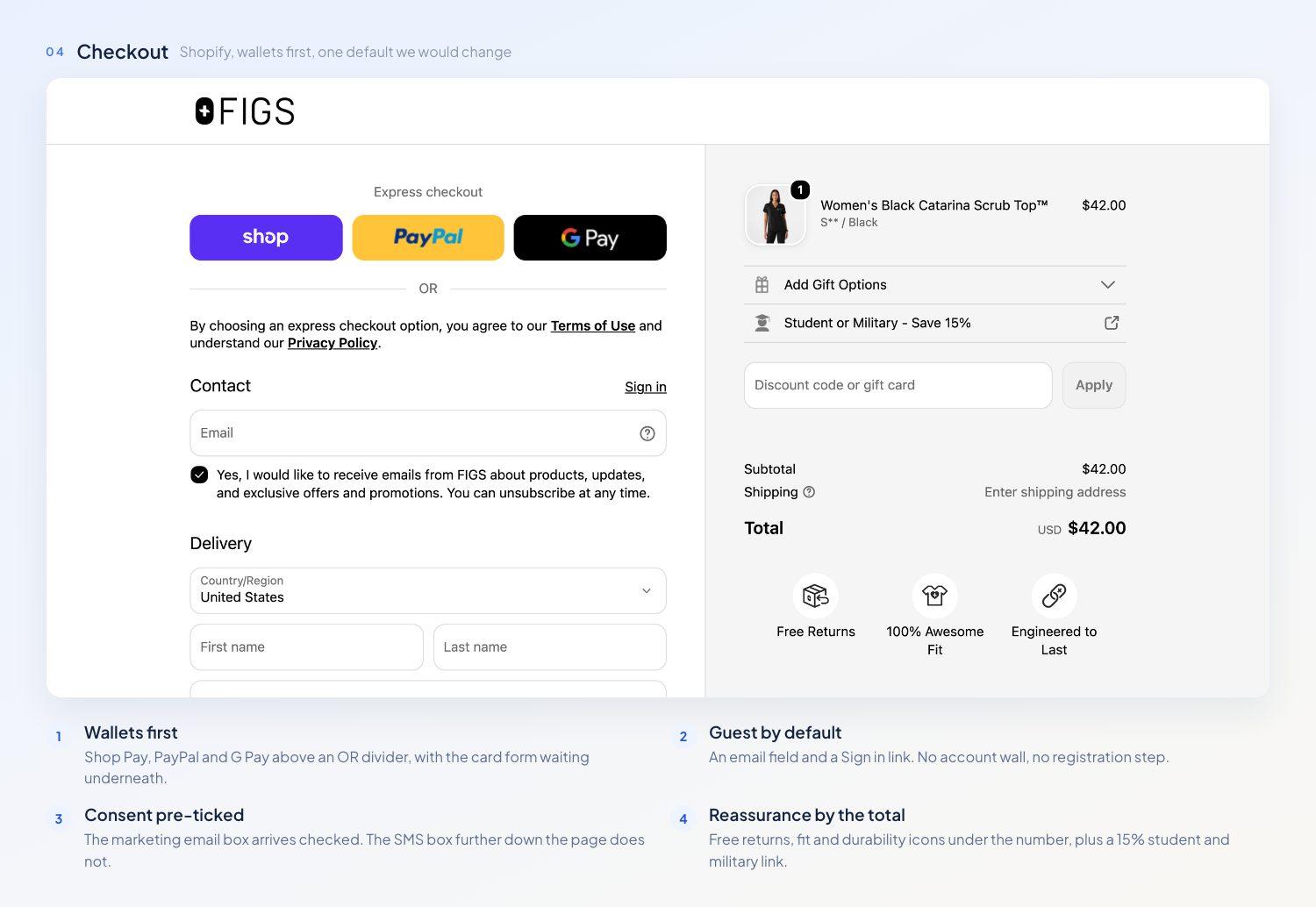
Shopify's stock checkout, wallets first, reassurance by the total, and one default we'd change.
Click Checkout and Shopify takes over on shop.wearfigs.com. Express wallets come first, Shop Pay, PayPal and G Pay in a row, then an OR divider, then contact and delivery. Baymard's asks for wallet buttons above the card form as distinct labeled buttons people opt into deliberately, instead of being funneled through one. Much of this is Shopify's stock layout. You're getting the guideline without doing anything.
The email field carries a Sign in link beside it and nothing more. That leaves guest checkout as the path of least resistance, and there's no registration step in the way. Forced registration pushes 24% out of a checkout, second only to cost. The discount code field is parked in the summary column on the right, off the main path. An empty coupon box in mid-checkout invites people to leave and hunt for a code, though we can't put a number on that from outside.
One default element stands out. The box asking to email you about products and promotions arrives already ticked. A pre-ticked box fails the EU standard, where the GDPR and the both require consent to be an active choice. That's the US checkout we saw, and EU shoppers may route through Global-e. It's worth checking before you copy it.
Beneath the total come three icons: Free Returns, 100% Awesome Fit, Engineered to Last. The first does real work. Return policy trouble drives 12% of abandoned checkouts in that survey, and putting the returns promise beside the number you're about to pay lands it where the doubt is. The other two are brand lines. Nothing in that column speaks to the 18% who quit because they don't trust a site with their card, though Shopify covers that itself in small type beside the payment methods. A Student or Military - Save 15% row opens in the same summary, above the discount field.
Where the Extra $85 Comes From
There's nothing clever in the sequence: a set block, a personalization row, and an accessory in the drawer, each one waiting until you've picked a size. The shipping counter drives the first add. Then the set block drives the second. Someone who came for a $42 top can leave with $100 of clothing. The $8 embroidery charge carries no fabric cost at all.
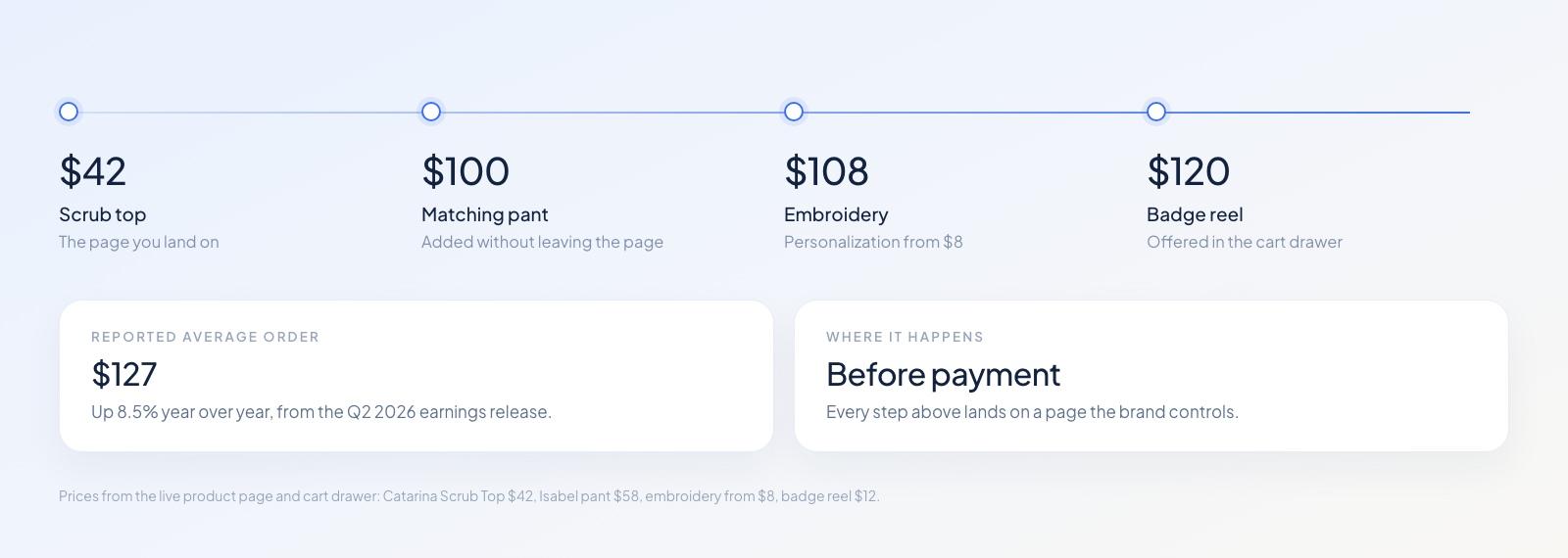
Four steps, all of them before payment.
What We'd Test Next
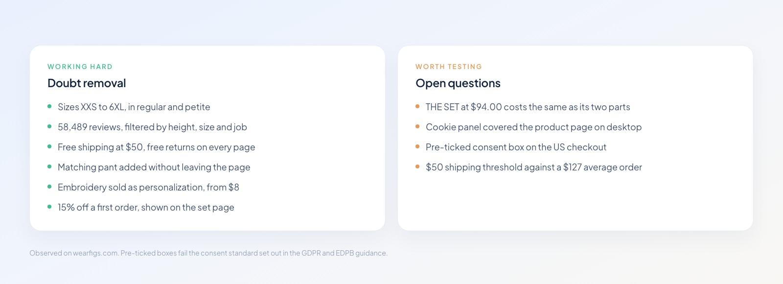
On the left, what we saw working. On the right, what we'd test.
Each item below is a hypothesis. None of it's a measurement. Pricing caught our eye first: THE SET has a page of its own at $94.00, while the $42 top and the $52 Kade pant bought separately cost the same $94.00. The set saves you nothing. A visible saving would give shoppers a reason to take both.
The cookie panel covered the lower left of the product page on a first desktop visit, over the gallery. The pre-ticked consent box is the second fix. Free shipping starts at $50 while the average order runs $127, and the counter had already hit its target the moment our set went in the cart. Would a higher threshold lift the average? Worth a test, though we can't call it a result yet.
Copy This Without the $2,300 Bill
Strip the custom front end away and you're left with four mechanics, none of which needs a platform contract.
Put the matching item on the checkout as an order bump, with the saving next to it.
Offer the cheap accessory after payment as a one-click upsell, where it can't slow the first purchase down.
Sell personalization as a paid extra.
Show reviews from people who share the buyer's job or body type, above the button.
You'll build all four in the Funnelish , with a conversion rate on every step.
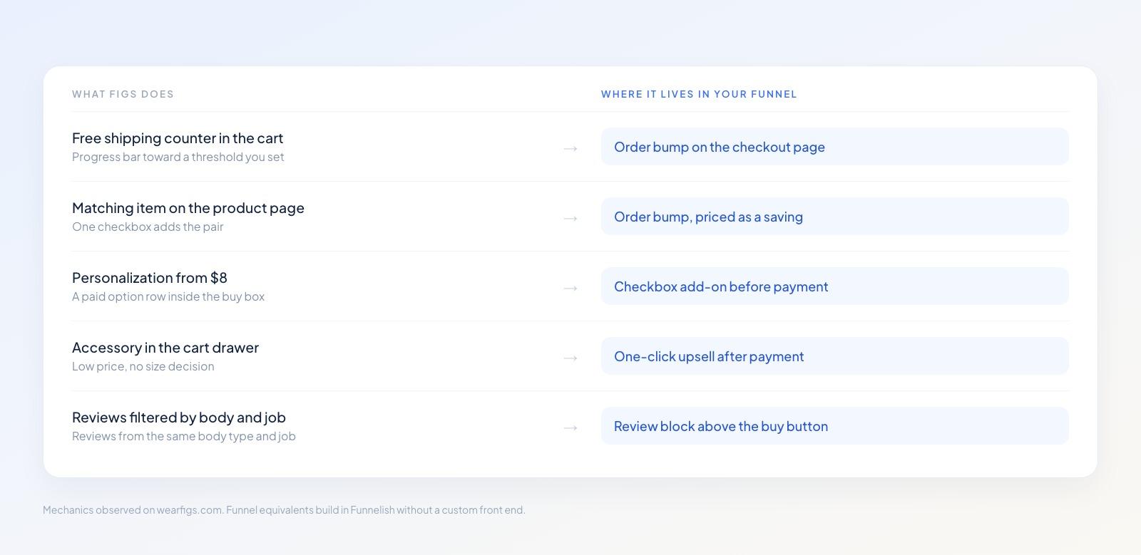
You can copy the mechanics without copying the platform bill.
Fetchlio, one of our free templates, already has the shape: bundle pricing on the landing page, an order bump at checkout, a one-click upsell after payment, and a downsell for anyone who says no. Swap in your product and prices in the , and you're running the same ladder.
FIGS Sales Funnel: Verdict
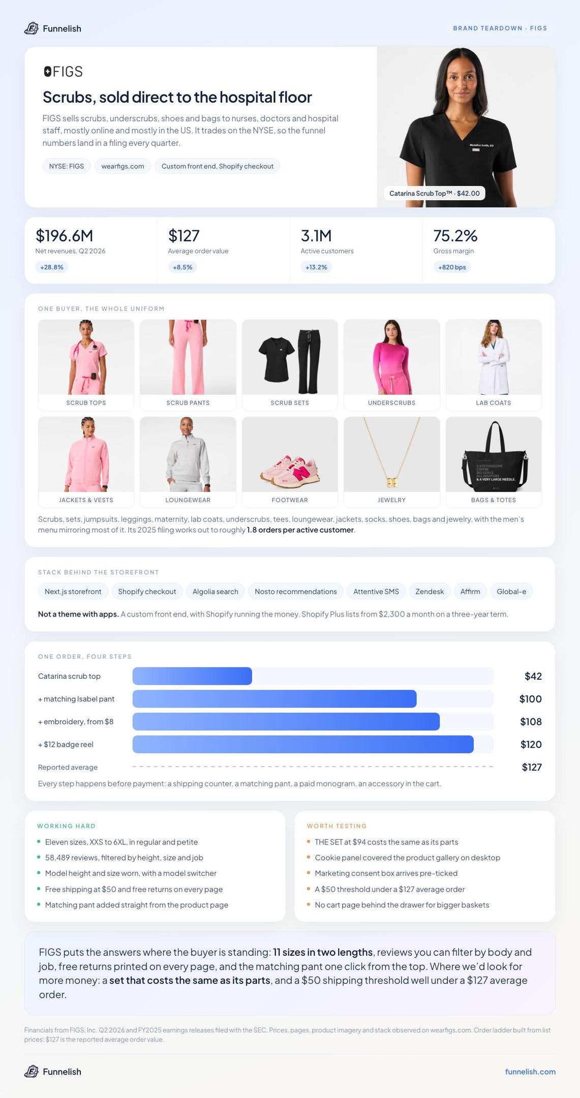
Save this one: the whole teardown on a single card, findings and open questions together.
FIGS puts the answers where you're already standing: eleven sizes in two lengths, reviews you can filter by body and job, free returns on every page, and the matching pant one click away. Where we'd look for more money: a set priced like its parts, and a $50 threshold set well below a $127 order. The consent checkbox ships pre-ticked, a fix that costs nothing.
Copy the first list. Fix the second before you scale traffic into it. The mechanics are free, even if the bill isn't.
Table of contents
Boost your eCommerce
sales today

24/7 support
No credit card required
Cancel anytime
24/7 support
No credit card required
Cancel anytime
