Brand Teardown: On Sells a $280 Shoe With No Sale. Here's How Its Funnel Pulls It Off
I walked every screen of On's store looking for a sale and couldn't find one. Here's what the funnel does instead, what its margin looks like, and five things you can steal.
On this page10 sections
Article Summary
- On holds its prices across the whole funnel. From the welcome popup to the payment form, there's no sale page, no countdown, and no coupon field in the cart. The shoe you start with costs the same when you pay.
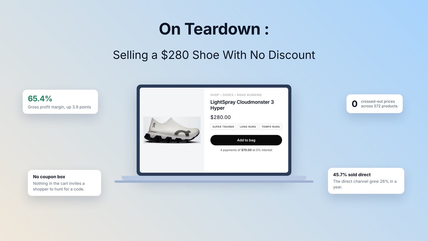
- That discipline shows up in the margin. On reported a 65.4% gross margin last quarter, up 3.9 points in a year. Nike's own annual report puts its margin at 42.9%.
- On still does discount, in two places. Last season's stock gets 20% to 46% off behind a LAST SEASON badge. Verified nurses, teachers, students, and military members get a single-use code through ID.me. Neither one reaches a shopper who's only browsing.
- Why this works. At a 30% margin, a 20% discount means you need three times the volume to break even. At On's 65.4%, you need 44% more orders. Lower margin, bigger bill.
- Five mechanics you can apply to your store. Put a spend floor on your first-order offer, use cases under product names, and fit answered in the buy box. Then clear the cart of anything to hunt for, and offer a payment plan instead of a price cut.
I went looking for a sale on On's website and couldn't find one.
I clicked through the welcome popup, the shop grid, a product page, the cart, and the checkout. The $280 shoe I started with was still $280 at the payment form. No banner counting down, no "Save $58" badge, no empty coupon box asking whether I'd found a better deal somewhere else.
For a Swiss running brand that's been around since 2010 and trades in New York as ONON, that's a choice, and the company says as much in its own numbers.
In this article, I'll walk you through all five screens and show you the two places On does discount. Then we'll run the math on what a markdown costs your store, and finish with five things you can lift into your own funnel. Let's dig in.
What do On's numbers look like?

The second quarter of 2026, On sold CHF 850.3 million worth of goods, up 13.5% from a year earlier. The goods themselves cost 34.6 cents of every franc.
Marketing, staff, and rent come out of what's left, leaving 12.3% of sales, or CHF 105.0 million. The same quarter a year before, the company lost money. All of it comes from its quarterly results.
Here's the number to watch: that 65.4% gross margin. Nike's latest annual report puts its own at 42.9% for the year ended May 2026. On's climbed 3.9 points in twelve months.
Close to half of what On sells now goes direct, at 45.7% of sales, and that channel grew 26.0% while wholesale grew 4.8%.
Where does a 65.4% margin come from?

There are two answers here, and you can copy one of them.
- The first is channel. Cutting the middleman out leaves On holding the retailer's share, and that's what the direct growth above is buying.
- The second is pricing, and On talks about it openly. Its explanation for the margin puts "an unwavering commitment to full-price discipline" in the same breath as the growing direct channel. On doesn't "compromise our full-price integrity for volume," CFO Frank Sluis said on results day, even in what he called a heavily promotional quarter.
The margin rose while the company absorbed higher US import tariffs, too.
In September, On turned that habit into a target. Its 2029 plan sets out an ambition to sustain a gross margin of at least 65% through 2029. The framework behind it, the Premium Playbook, puts "a high full-price share" in writing.
What does On's site run on?

If you're planning your own build, this split is worth looking into.
- Storefront: built in house on Nuxt, a framework for Vue, with content coming from Contentful.
- Checkout: rented. Click the button on on.com and you land on checkout.on.com, an address that resolves to a Shopify store.
- Measurement: Segment routes customer data, Amplitude covers analytics and session replay, Hotjar records sessions.
- Everything else: OneTrust runs consent, Cloudflare handles delivery and bots, and in the small print of its signup form On names Sailthru and Braze for email.
You don't need a custom front end to copy the logic here. The point is that On spends its engineering on the brand experience and rents the part that has to take money without breaking.
What happens on each of the five screens?
Here they are in order, with what each one does for the sale.
1. Welcome popup

Before you've seen a shoe, you get news, product drops, and this: "Enjoy 10% off your first order when you spend $125 or more."
Look at the floor on that offer. This season's shoes start at $140, and one pair clears $125 on its own. Anything cheaper leaves the offer asking you for a second item. A flat 10% would hand money back on a sale you'd already made.
The form wants an email and nothing else. One field, one button.
2. Shop grid

572 products, and the view the shop opens on carries no sale flags at all. I went through the first sixty tiles without meeting a marked-down price.
Prices come in whole dollars: $140, $150, $160, $170, up to $280. No decimals ending in 99.
Under every product name, you get the job the shoe does. "All-day wear, CloudTec®." "All-day, CloudTec®, Helion™ superfoam." You're sorting by what you want to do, with price second.
3. Product page

Ask for the Cloudmonster and three tags run across the top: SUPER TRAINER, LONG RUNS, TEMPO RUNS.
Open the second one and a long run turns out to be a sustained effort past 15km, wanting plenty of cushioning. The third explains a tempo run as a "comfortably hard" effort and tells you to look for a responsive shoe.
That's a page teaching you how to choose before it asks for $280. Nielsen Norman Group's product page research says descriptions should explain terms shoppers won't know, and that a full one leaves people confident about returns.
Below that, the buy box clears the questions that stop a sale:
- Fit: "Regular. True to size.", plus a size table in six sizing systems.
- Returns: free, inside 30 days.
- Shipping: free over $50.
- Included: "Includes the Elite Run Sock High Hyper."
- Payment: "4 payments of $70.00 at 0% interest with Klarna."
That last one is my favorite thing on the page. On splits the payment and leaves the number alone.
One miss: the size picker had two sizes missing instead of greyed out. The same research lists product availability as a must-have, and you can't tell a size On doesn't make from one it's sold out of.
4. Cart

The shoe with its color and size, a quantity control, and a summary reading Shipping Free and Total $280.00. Under the Checkout button come "Free 30 days return" and the payment logos.
What's missing is the point. No coupon field appears anywhere on the page. The only input is the newsletter box in the footer.
Nielsen Norman Group's discount research watched what an empty code box does to someone without a code. They leave the page to hunt for one, and some leave the site.
Add-ons live under the total instead of between you and it: socks at $25, a cap at $45, a shoe pack at $35, a belt at $40. All of them go with a running shoe. Two of the six are socks, though, and the shoe in the bag already ships with a pair.
5. Checkout

A wallet button comes first, then "Returning Customer? Log in for a faster checkout" as a link you can ignore. The form itself comes under the heading Guest checkout, with Sign in beside it in small type. Nobody is forced to open an account.
And here's the discount code box, next to the order summary. On didn't remove the field, it moved it. By now you've chosen a shoe, picked a size, and clicked through to pay, where the same box in the cart would have met a browser with nothing invested.
One thing I'd fix: the newsletter box comes ticked for you. In the UK and the EU that doesn't count as permission. The ICO's guidance on valid consent quotes the law directly, and silence and pre-ticked boxes aren't consent.
Does On ever discount?

Yes, in two places, and both are worth studying.
Last season's stock
Sort the shoes by price, low to high, and sixteen of the first sixty-four carry a LAST SEASON badge and two prices. THE ROGER Clubhouse runs $80, down from $140. Cloudmonster 1 runs $105, down from $180. The cuts go from 20% to 46%, median 32%.
Every one of them lands on last season's stock. This year's Cloudmonster is $280 and stays $280. The product page labels the pair plainly as "current price" and "original price," with no percentage flash and no clock on it. And because the default sort keeps the rack out of view, anyone who hasn't gone looking meets full prices down the whole grid.
Community discounts
A footer link leads to a program where nurses, teachers, students, military members, and first responders verify through ID.me and collect a single-use code, twice a month at most. Limited editions, last-season items, and gift cards are excluded. That's also why a discount box exists at checkout at all.
Neither discount pays out to a shopper who only waits.
What does a discount cost you?

Run this with your own numbers, because it's the part many store owners skip.
A discount comes out of your margin. Your price is only where it shows up.
Knock 20% off at a 50% margin and you keep 30 cents instead of 50, needing 67% more orders to make it up. At a 30% margin, the same cut leaves a third of the profit per sale, and only three times the volume gets you level.
At On's 65.4%, a 20% cut still costs 44% more orders. The number gets friendlier as the margin rises, and that's the quiet reason a premium brand can afford to discount while a thin-margin one can't. On has the most room to cut and uses the least of it.
None of that table shows the second cost, because every sale trains people. Run enough discounts and buyers learn to wait, and your full price stops reading as a real price.
What would I test next?

Conversion data stays with the company, and a store only shows you its design. Take these as educated guesses:
- Untick the newsletter box. Say what the list is for and lose the subscribers who had no plan to open anything.
- Grey out the sold-out sizes. Add a notify option, and the page stops looking thinner than the range.
- Hide the discount field behind a link. It's already in the right place, and a "Have a code?" link would cost an afternoon and kill the last prompt to go looking.
- Raise the $125 floor. Any order with a current shoe in it clears that bar already.
- Give the markdown rack a page. It sells at 20% to 46% off where no shopper finds it without sorting by price.
5 things you can steal from On's funnel

None of this needs a Swiss design lab or a nine-figure marketing budget.
1. Put a floor under your first-order offer.
"10% off orders over $125" grows the basket in a way that "10% off" can't. Set your floor a little above your most popular single item.
2. Write the job under every product name.
Use the words a buyer would use, like "long runs" and "all-day wear," and let people filter themselves into the right product before price enters the conversation.
3. Teach the choice on your product page.
Explain the problem your product solves, then present the product as the answer. Confidence is what turns a high price into a decision.
4. Answer fit, shipping, and returns inside the buy box.
That's where the hesitation happens. Put the answers there instead of three scrolls down in a tab nobody opens.
5. Get the coupon field out of your cart.
If you need one, put it past the point where somebody has committed, the way On does.
Tip: Split the payment before you cut the price. On's "4 payments of $70.00" keeps the $280 intact and takes the sting out for the buyer.
All five are steps you can lay out and measure end to end in the Funnelish funnel builder.
Of our free templates, Loofy Food lands nearest to what On is doing. It sells one product instead of a bundle, and it answers the risk question inside the buy box, with a 30-day money-back guarantee under the button. On does the same job with free 30-day returns. The checkouts work alike as well: On offers four Klarna payments on one price, Loofy offers three ways to buy the same item. Both change the commitment and leave the number alone. Put your own product and prices into the page builder.
Get the Free Loofy Food Template
Bottom line

The cleanest thing about this funnel is what's missing: no countdown, no savings total, no coupon box between you and this season's price. What's left has to earn the sale on its own, and every screen pulls its weight.
You probably can't charge $280 for your product. You can stop apologizing for whatever you do charge, and the five mechanics above are how On makes that stick.
Written by
Anna P.
Writes for the Funnelish blog: playbooks on funnels, checkout, payments and growth for DTC brands.