

Brand Teardown: Warby Parker Retired the Funnel That Built It
02 October 2026
Anna P.
12 minutes
Warby Parker sells prescription glasses direct, starting at $95 with the lenses included. For most of its first decade the way in was a cardboard box: pick five frames, wear them at home for five days, mail them back. Other brands copied it. Business schools taught it.
At the end of 2025 the company switched it off. We spent an afternoon inside the funnel that replaced it, from the first screen to the login page guarding checkout, with two filings open on the other monitor. The route is longer now, and it holds far more places to spend money.
Warby Parker in 2026: Numbers
These are the company's own numbers, the ones it has to file. Net revenue for the June quarter came to $235.5 million, up 9.8%, with $4.6 million of net income under it. Both appear in the , published August 6, 2026.
The funnel numbers matter more than the revenue line. Over the trailing twelve months 2.71 million people bought something, 4.1% more than the year before, and each spent $336 on average, up 6.6%. A year of buying here can hold a pair of glasses, a box of contacts and an eye exam, and that $336 isn't one order.
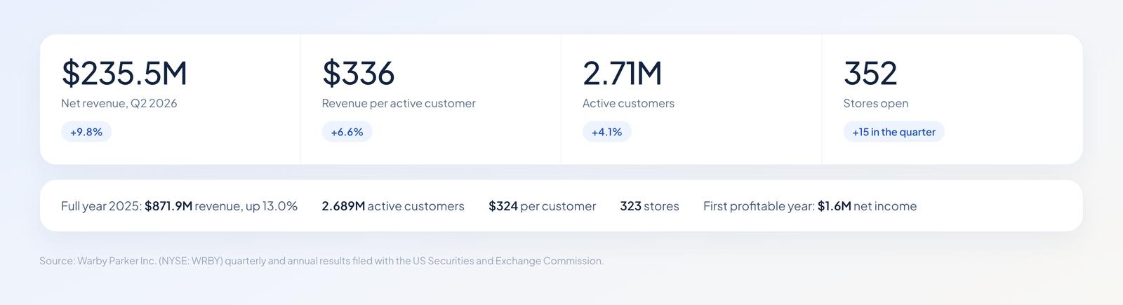
Quarterly filings make this the rare D2C funnel with published arithmetic behind it.
The store count tells the other half. This quarter ended with 352 shops after 15 openings in three months, and 2025 closed with 323 after 47. A brand that launched without a single storefront now runs more than three hundred, and 2025 brought its first full year of profit at $1.6 million.
Read more: Brand Teardown: How FIGS Turns a $42 Scrub Top Into a $127 Order
The Box They Stopped Shipping
Home Try-On was a lead magnet with postage. Five frames arrived free, you kept them five days, you mailed them back, and the company had your address, your taste and a reason to email you. It also carried a shipping bill in both directions, plus frames that didn't come back in sellable shape.
The records the ending in accounting language. It books one-time inventory write-downs against a decision taken in the second quarter of 2025: to "sunset our Home-Try On program at the end of 2025." Advertising, meanwhile, kept climbing, from $76.1 million in 2023 to $113.9 million in 2025. On 2025 revenue that's 13.1 cents of every dollar, or roughly $42 for each active customer.
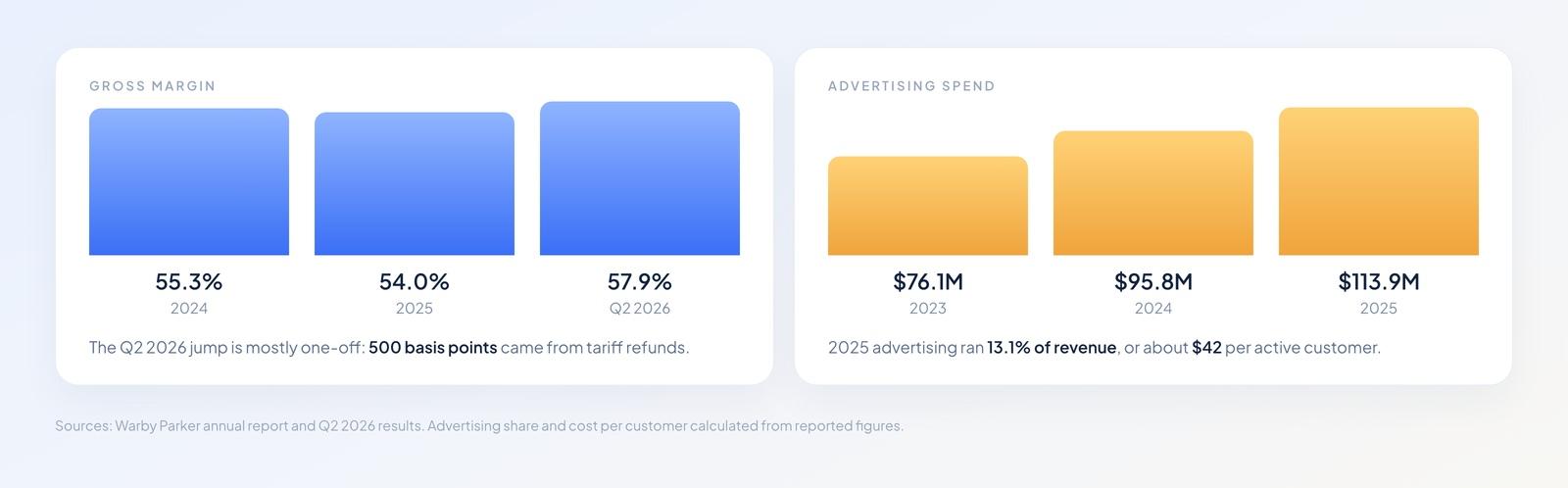
Advertising climbed three years running. The Q2 2026 margin spike is mostly a tariff refund.
The company's own FAQ answers the why. It names four replacements: the style quiz, an AI Advisor that scans your face in the iOS app, Virtual Try-On on the web and in both app stores, and the stores themselves. Put it next to the numbers and the trade looks deliberate. Shipping five frames each way costs real money every time; a quiz costs nothing per run, and a shop sells lenses at full margin with an optometrist attached.
What the Site Runs On
The storefront is a custom Next.js app, the checkout lives on warbyparker.com, and the identity step in front of it runs on a separate host at auth.warbyparker.com. There's no third-party commerce platform anywhere in the path.
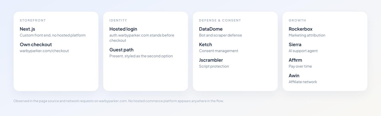
A custom front end, a custom checkout, and a defensive layer many storefronts skip.
Around it comes a layer you rarely see on a D2C site this size: DataDome for bot defense, Jscrambler wrapping the scripts, Ketch handling consent. Growth tooling runs alongside, with Rockerbox for attribution, Sierra answering support questions, Affirm for installments and Awin on affiliates. You'll need engineers for all of it, and a budget that has little to do with the funnel itself.
Page by Page
Six stages stand between a first-time visitor and a card form: home page, quiz, frame page, lens builder, cart, login. We went through them in order and weighed each one against what the usability literature says about the same pattern.
Home Page
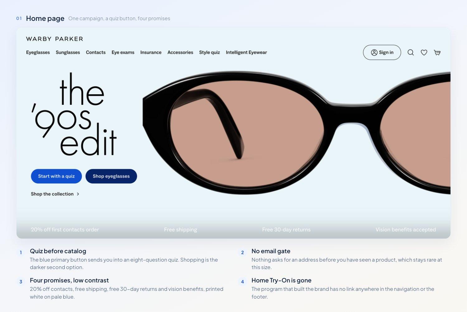
The blue button opens a quiz. Home Try-On has no link anywhere on the page.
One campaign owns the screen, with two buttons under it: Start with a quiz, and Shop eyeglasses. The quiz gets the blue primary treatment and the catalog gets the dark secondary. Eight items run across the navigation, and a strip below the hero carries four promises: 20% off a first contacts order, free shipping, free 30-day returns, vision benefits accepted.
Putting a quiz ahead of the catalog is the choice worth noting. It costs some clicks on the way to the product, and it buys structured answers the brand can route on. We reached a product page without being asked for an address once, and at this scale that's unusual.
There's a problem with that promise strip, though. The text renders in white over a pale gradient, thin and low in contrast, and the four claims doing the most reassurance work are the hardest thing on the page to read.
Style Quiz
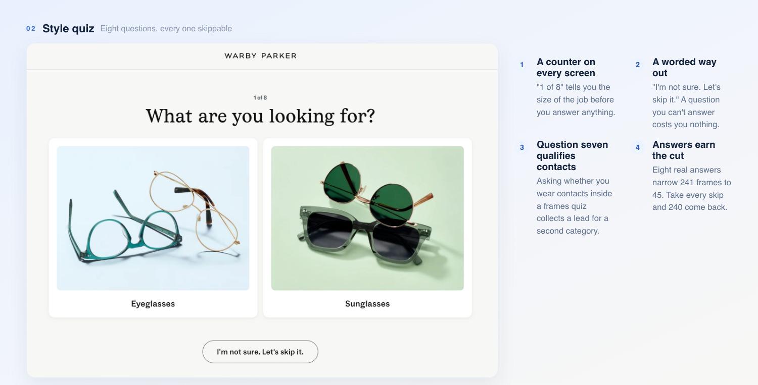
Eight screens, a counter on every one, and a way out of each question.
Eight questions, each on its own screen: eyeglasses or sunglasses, women's or men's styles, shapes, colors, materials, head size, and whether you also wear contacts. A counter reads "1 of 8" and climbs. A back arrow waits in the corner. Every question carries an out, worded like a person: "I'm not sure. Let's skip it."
Skippable questions with a visible counter are the right build. You know where you are, and a question you can't answer doesn't end the session. Question seven does extra work: asking whether you wear contacts inside a frames quiz qualifies a second category while the buyer is still answering easy ones.
Then comes the email screen, and the hierarchy flips. That checkbox is ticked when it appears. Under the GDPR a box you have to untick isn't consent at all, and the spells out why. Its blue primary button reads "No, thanks." They've made skipping the prominent option and pre-ticked the box for anyone who stays.
After that, a "Calculating your results" interstitial holds you for a few seconds and spends them selling: glasses start at $95, prescription lenses included, free shipping, free returns within 30 days. It's a manufactured wait, spent landing the pitch while attention is captive.
Then the payoff arrives, and what it's worth depends on what you fed it. Answer the questions properly, picking two shapes, two colors, a material and a head size, and the quiz returns 45 frames across five pages. Take the skip on every screen instead and it returns 240 of the catalog's 241.
That gap is the tension inside the design. A friendly way out waits on each screen, and every one you take costs you the filtering you came for. What arrives either way is the standard grid with a "Style quiz results" chip on the filter bar, and nothing on it explains why these frames made the cut.
Frame Page
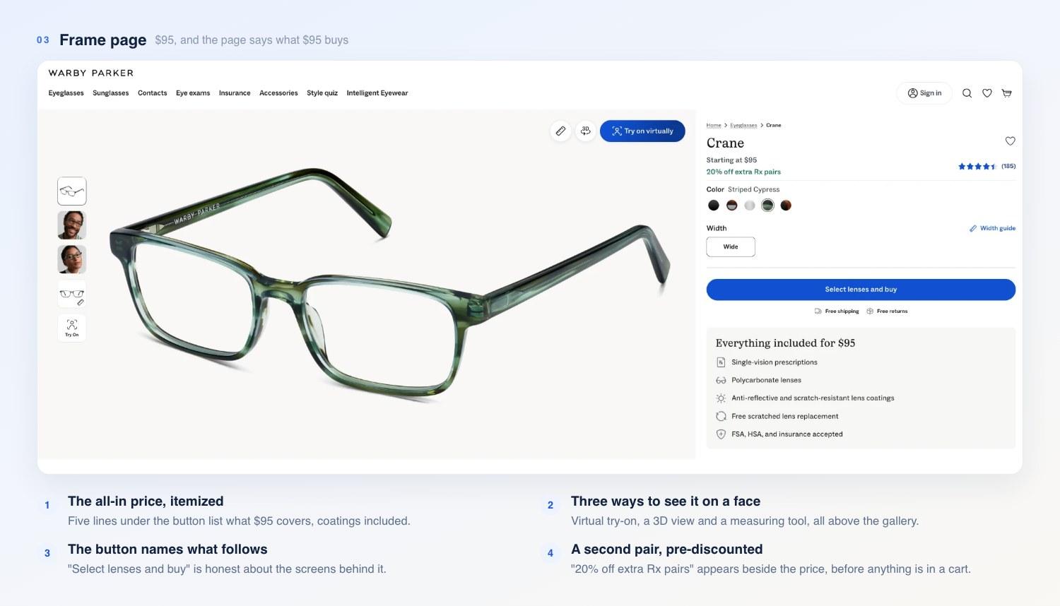
The all-in price, printed where the decision happens.
The Crane costs $95 and carries 185 reviews at 4.5 out of 5, with five colors, a width guide beside the single width it comes in, and a "Try on virtually" control on the image. Below the button, the page prints what $95 covers: single-vision prescription, polycarbonate lenses, anti-reflective and scratch-resistant coatings, free replacement of scratched lenses, and FSA, HSA and insurance accepted.
Spelling out the all-in price is the strongest thing here. You're told the whole cost before committing to anything. Baymard's counts 43% with no shipping information on the page and 42% with no route to a return policy. This page settles both, plus the question every eyewear shopper carries: what they'll pay for lenses on top.
The same screen opens two paid paths. "20% off extra Rx pairs" appears next to the price, and the main button reads "Select lenses and buy" instead of add to cart. That wording's honest about what comes next, and what comes next is where the money is.
Lens Builder
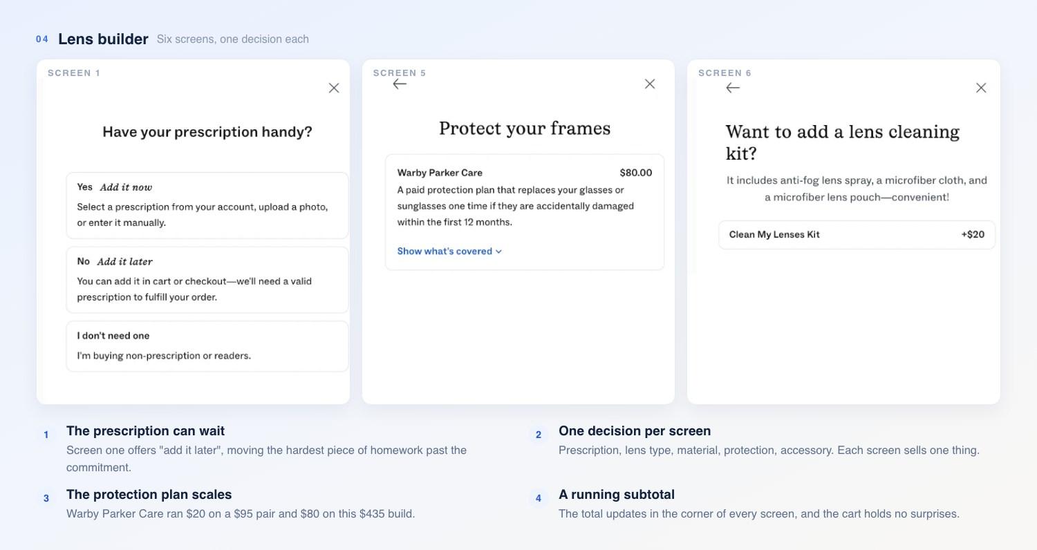
Screens one, five and six. A subtotal in the corner follows you through all of them.
Click through and you'll get six screens, one decision each, with a running subtotal in the corner the whole way.
The first screen asks whether you have your prescription handy and offers three answers: add it now, add it later, or I don't need one. Deferring the prescription is the best conversion move in this funnel, and it's the one we'd copy first. It takes the hardest piece of homework in online eyewear and moves it past the commitment, and the copy says plainly where it'll come back: "You can add it in cart or checkout."
From there it's a price ladder. Prescription type opens with single-vision at $95 and progressives at $325. Single-vision type offers standard free or anti-fatigue at $100, labeled "Ideal for screens." Lens type runs classic free, blue-light-filtering at $50, light responsive at $125. Lens material goes classic free, thinner at $60, thinnest at $160.
The last two screens price themselves against the order. Warby Parker Care, the protection plan, came to $20 on a $95 single-vision pair and $80 on a $435 progressive build. The final screen offers an accessory, and which one depends on the frame: polarized sun clip-ons at $75 on one, a $20 lens cleaning kit on another.
Keeping a running subtotal visible through all of it is the part worth copying. Every screen changes the price, and you'll see the number move. Nobody's surprised at the cart.
Cart
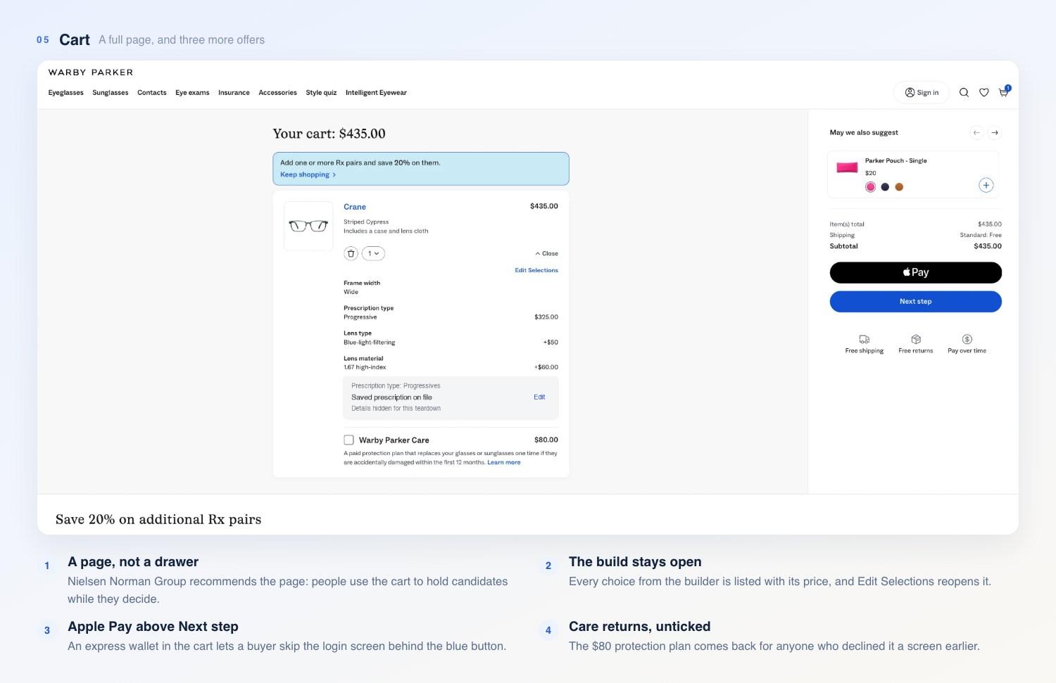
A real cart at $435, with every lens choice priced on the line item.
The cart's a page of its own at /cart, and the drawer pattern is nowhere in sight, like some brands do. It's the arrangement Nielsen Norman Group recommends. Its describes people using the cart to hold candidates while they decide, and mini-carts squeezing that comparison into a panel too small for it. An "Edit Selections" panel stays open on the line item too, and you can still see and change every choice from the builder.
The page carries three offers. A banner reads "Add one or more Rx pairs and save 20% on them." Warby Parker Care comes back, unticked, for anyone who declined it in the builder. A "May we also suggest" carousel holds a pouch, a case and a lens kit at $20 each, and a second carousel runs ten frames under "Save 20% on additional Rx pairs."
Whether any of it belongs there turns on relevance. In Baymard's , 52% of desktop carts push products with no link to the basket, or chosen only because other shoppers bought them, and its testers wrote off a whole recommendation engine after meeting one odd suggestion. A case and a cloth for the glasses you've configured clear that bar with room to spare.
Checkout Door
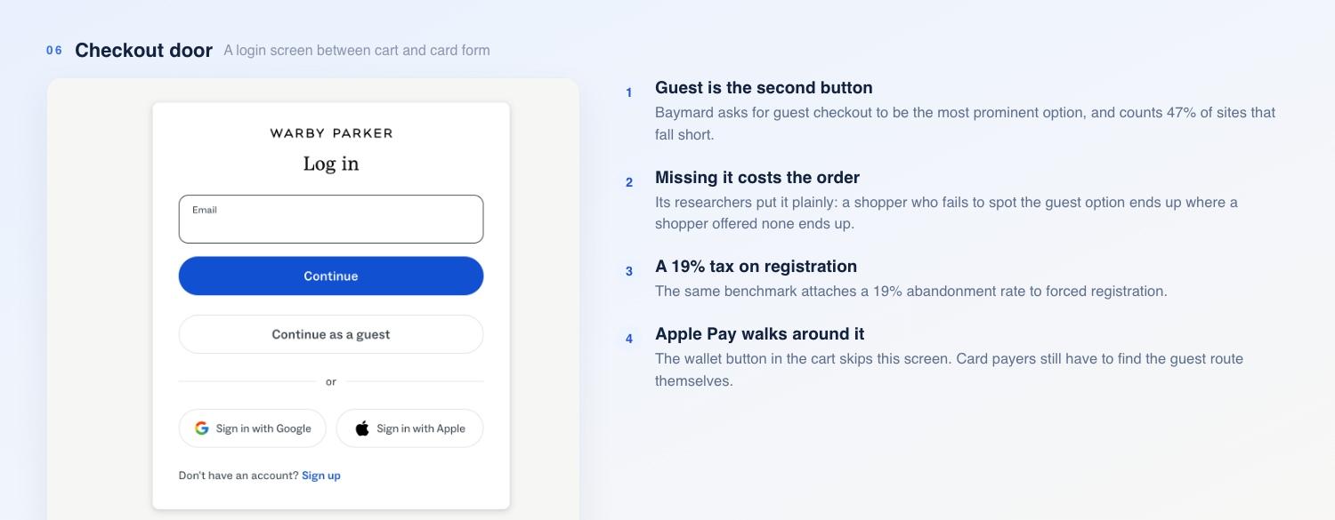
Guest checkout is on the screen. It's also the second thing on it.
An Apple Pay button waits above "Next step" in the cart, and anyone who takes it skips what follows. Click the blue button instead and the cart hands you to a login screen on another host. An email field and a blue Continue button come first. Sign in with Google and Sign in with Apple follow. "Continue as a guest" is there, styled as a white outline button in second place.
That's the weakest link in the walk. Baymard's guidance here isn't ambiguous: guest checkout should be , and 47% of sites that offer it fall short of that. Its researchers put the consequence plainly: if a user fails to spot guest checkout, they're in the same place as a user who wasn't given the option. That benchmark also puts a 19% abandonment rate on forced registration, and a guest button in second place still charges part of it.
Past the door, the first checkout screen asks for name, email and phone, and the SMS consent box arrives unticked. The button names the step after it, "Next: Frames prescription," and that's the only clue about what remains. You don't get a step count or a progress path. Baymard's asks for a progress indicator that maps the process one to one, because hiding or grouping steps disorients people mid-flow. We stopped there. Going further meant handing over real personal details.
Where the $95 Goes
The ladder hides nothing and pushes nobody. Each screen offers one upgrade, explains it in a sentence, and updates the subtotal. The cart we ended up with shows where that leads: a $95 frame, progressive lenses at $325, blue-light filtering at $50 and high-index material at $60, for a line item of $435. Two more screens had already offered $80 of protection and a $20 cleaning kit on top.
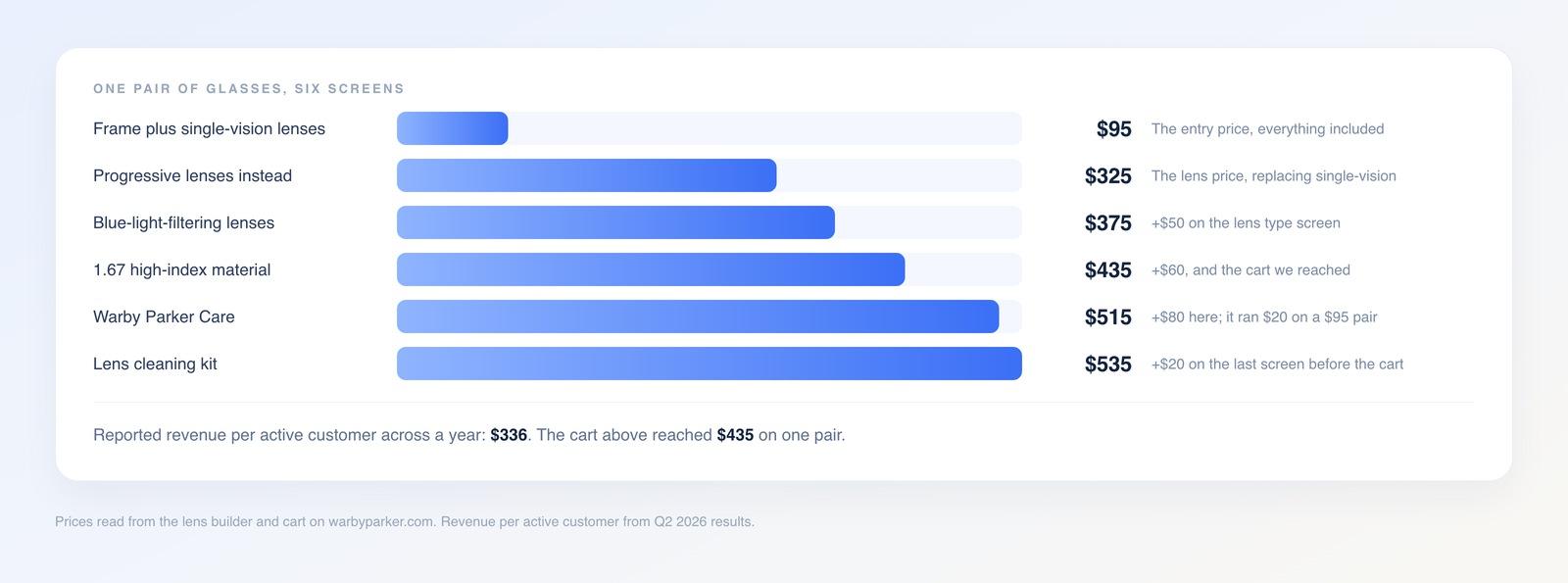
One build, screen by screen, from $95 to $535.
Set $435 against the $336 the company reports per active customer across a year and the shape of the business shows through. The headline price gets people through the door, and the lenses, the coatings, the protection plan and the second pair do the earning.
What We'd Test Next
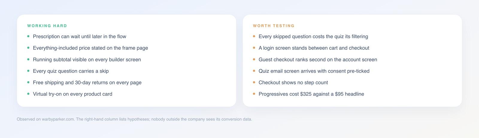
Left column: verified on the live site. Right column: hypotheses we'd put in front of traffic.
Treat the list below as guesswork with reasons attached. Conversion data stays inside the company. We're reading a site here, and a site only shows you the design.
Fixing the quiz result would come first. Forty-five frames is a real cut from 241, though it lands as an unranked grid, and a dozen frames with a line each on why they fit would repay eight answers better. The skip buttons are the other half of that test: they keep people moving, and they also hand back a result worth nothing. The login door comes next: guest hides behind a blue button aimed at people who already have accounts, and the cheapest test swaps the visual weight without moving anything else.
Copy This Without the Custom Platform
Strip out the Next.js build, the bot defense and the 352 shops, and you're left with five mechanics, none of which needs an engineering team.
Defer the hard question. The brand takes the order before it takes the prescription, and any funnel can take payment before it collects a fitting, a size chart or an onboarding form.
Sell the upgrades one screen at a time with the total in view.
Put the protection plan on the last screen before the cart, where it reads as care instead of a pitch.
Hold the accessory back until payment clears, where a one-click upsell costs the first order nothing.
Offer the second unit at a fixed discount in the cart. All five go together in the Funnelish , and each step reports its own conversion rate.
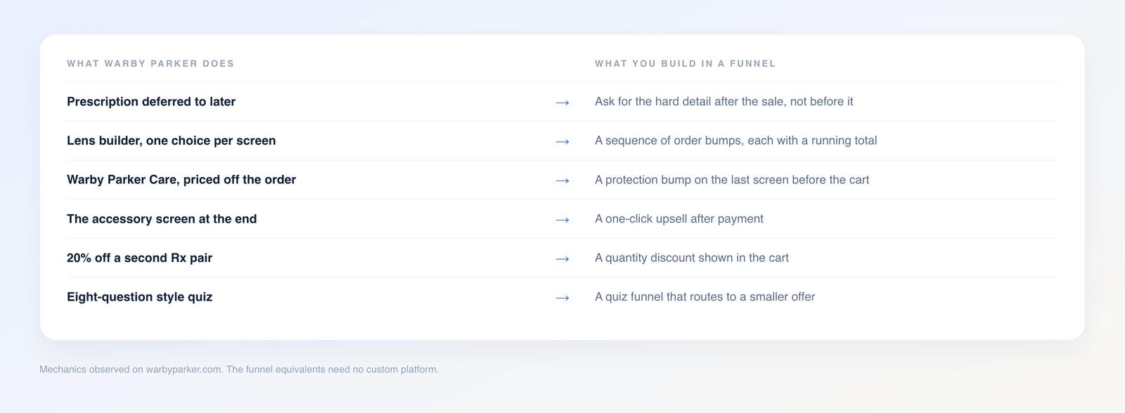
The sequence is the transferable part. The engineering isn't.
Loofy Food, one of our free templates, already runs part of this shape. Its checkout puts three prices on one product, $64.99 once, $55.99 on a subscription or $155.99 for three packs with a travel bowl thrown in, and a 30-day money-back guarantee under the button. Warby Parker's pattern turns up there in miniature: one item, tiered commitment, a quantity deal and a promise covering the risk. Load your own prices in through the and you're running the same ladder.
Verdict
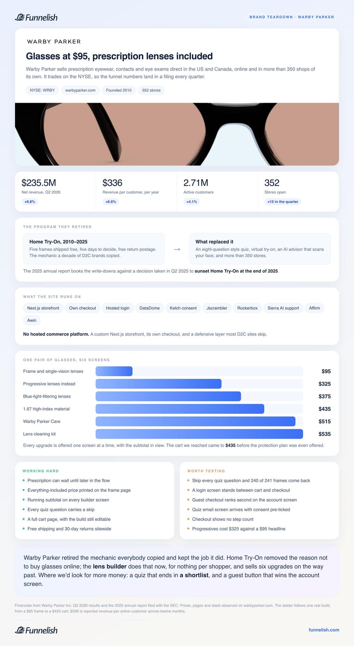
One card, no article needed: the numbers, the ladder and both lists.
They've retired the mechanic everybody copied and kept the job it did. The box removed the reason not to buy glasses online; the lens builder does that now, for nothing per shopper, and sells six upgrades on the way past. The quiz, the deferred prescription and the running subtotal are free to copy this week.
The money we'd chase next is in two places: a quiz that ends in a shortlist, and a guest button that wins the account screen. The left-hand list is free money. The right-hand list is worth fixing before the traffic arrives.
Table of contents
Boost your eCommerce
sales today

24/7 support
No credit card required
Cancel anytime
24/7 support
No credit card required
Cancel anytime
