

How to Create a Sales Funnel
02 September 2026
Anna P.
14 minutes
Quick answer: Pick one offer and build seven pages around it: a home page, a landing page for that single offer, a checkout with one or two small add-ons, a post-purchase upsell, a downsell for anyone who declines, a thank you page, and your policy pages. Send traffic to the landing page rather than the home page. Then measure the drop between each pair of pages and fix the widest one. A first ecommerce sales funnel takes an afternoon to assemble and pays for itself through the pages that come after the sale, which cost nothing extra in advertising.
Guides on how to create a sales funnel tend to stop at the diagram. You get the four stages, an arrow pointing down, and no answer to the question you came with, which is what to put on the screen. This one walks through a working sales funnel page by page, using a natural skincare funnel selling a $24 body lotion, and shows what each page is for and what it earns.
Why a Sales Funnel Beats a Product Page
A product page asks for one decision. A funnel asks for a sequence of small ones, each easier than the last, and each worth money.
The difference shows up in the numbers. Send a visitor to a product page and the best outcome is a $24 sale. Send the same visitor through a funnel and the path runs $24 to $44 to $49.99 to $72.98, with every step after the first costing nothing in traffic. Getting more sales out of the same traffic is what makes a sales funnel important to a small budget, and it holds whether you run an online business or a brick and mortar store adding an online channel.
A sales funnel is a visual representation of the customer journey, and it gives revenue teams a shared picture of where potential customers enter, where prospects drop out, and which marketing efforts brought them. Without one you are guessing. With one you can point at a page and say what it cost you this week, which is where turning more prospects into paying customers starts.
Start With One Offer
Before you build a page, settle three things. Skipping this is why many first attempts stall.
Who it is for. Write down your ideal customer in a sentence. Buyer personas built from customer interviews beat personas built from imagination, and five conversations with satisfied customers will tell you more about your target audience than a shelf of industry reports. Ask what they tried before you, what nearly stopped them buying, and what they typed into Google. Those answers become your headline.
What the pain points are. The skincare funnel in this walkthrough leads with dry, dull skin and sensitivity. Every page repeats that promise. Consistent messaging across multiple touchpoints is what makes a funnel feel like one experience rather than a set of unrelated sales pages.
What the single offer is. One product, one price, one call to action. You can add variety later through bumps and upsells, and those come after the buying decision, where they do no damage.
Your business model decides how much structure you need past this point. A $24 impulse purchase closes in one session. A $9,000 contract with key decision makers involves a sales pipeline, sales reps, and a specific sales process behind the funnel, which is a different build with the same skeleton.
Build the Funnel Page by Page
Here are the essential elements of a working natural skincare funnel, in order, with what each page does.
Home Page
The home page carries the brand and catches people who arrive by searching your name. The skincare version leads with "Better Skin. Better Ingredients," a product shot, a 4.9 out of 5 rating from 25,000 customers, and three trust badges reading natural ingredients, cruelty free, and skin barrier support.
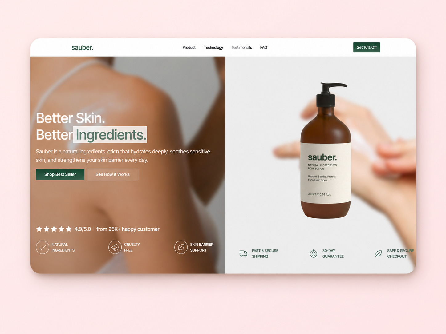
Notice what it does not do: carry your ad traffic. Paid clicks go to the landing page. A home page offers a nav bar and five ways to leave, which is fine for browsing and expensive for conversion.
Landing Page
This is where your paid ads and social media marketing traffic land, and it is the page worth the most attention, since it decides whether the qualified prospects you paid for turn into buyers. The skincare landing page holds a countdown timer, a "Get 10% Off for First Timer" banner, the product at $24 struck through from $32, four benefit checkmarks, and two purchase options side by side.
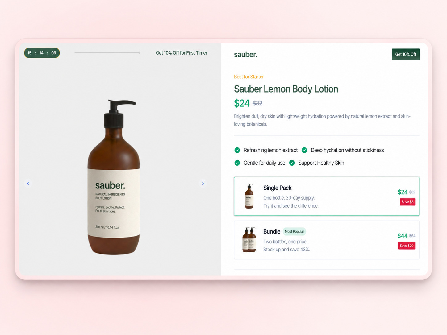
A landing page has to answer three questions fast: what is offered, who it is for, and why act now. The countdown supplies the third, the "Best for Starter" label supplies the second, and the price block supplies the first. Below that sits a review from a named customer with a photo, because website visitors trust a face more than a star rating.
The two options matter more than they look. Single Pack at $24 for a 30-day supply, Bundle at $44 for two bottles marked Most Popular. Presenting both can raise the average order without pressure, and the Most Popular tag does the work of a recommendation. Moving a buyer from single to bundle can lift that order 83%.
Whatever savings figure you print, check it against your own arithmetic before you publish. A bundle badge that claims a percentage your prices do not produce is the kind of small inconsistency a careful buyer notices, and trust is hard to win back mid-checkout.
Read more:
Checkout Page
The skincare checkout puts the form on the left and the order summary on the right, with a 15-minute countdown at the top. It asks for name, email, phone, address, country, state, and ZIP, then offers three shipping options. Two order bumps sit above the summary as tappable cards: Sauber Travel Size at $5.99 and Mini Sunscreen at $2.99.
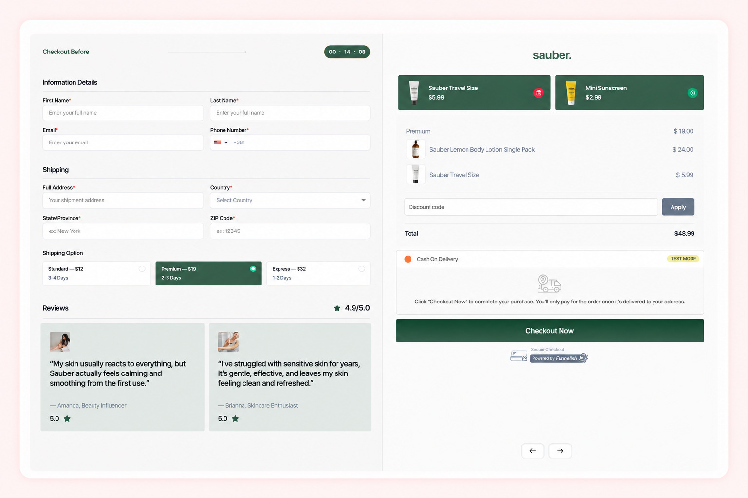
Order bumps are the highest-return real estate in the whole funnel. The buyer has already decided. Adding $5.99 to a $44 order at a 30% take rate earns $1,797 for every 1,000 checkouts, and you paid for that traffic once.
Two reviews sit under the form with a 4.9 average, which is deliberate placement. Doubt peaks at the payment step, and social proof next to the credit card field answers it where it happens.
Read more: Shopify Checkout Optimization: How to Bypass the Default and Save Your ROAS
Upsell Page
After payment, the funnel shows a natural body soap at $20 against a full-width photo. The buyer's card details are already stored, so accepting takes one tap with no re-entry.
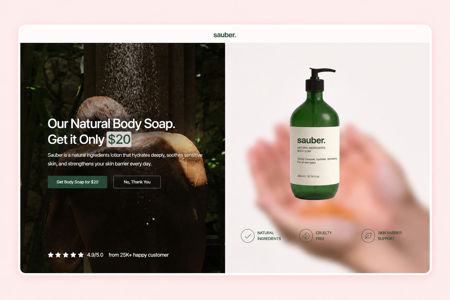
This page exists because the moment after purchase is the most receptive one a customer will have. At a 15% take rate, a $20 upsell adds $3,000 per 1,000 checkouts. Keep the offer close to what they just bought. Body soap after body lotion works because the two belong together.
Read more: Upselling Techniques: Digital Upsells + Physical Products for Margins You Actually Keep
Downsell Page
Anyone who declines the upsell sees "Don't Leave Empty Handed, 2 Bottles for $46." The downsell recovers part of the revenue from a no by lowering the commitment or changing the shape of the offer.
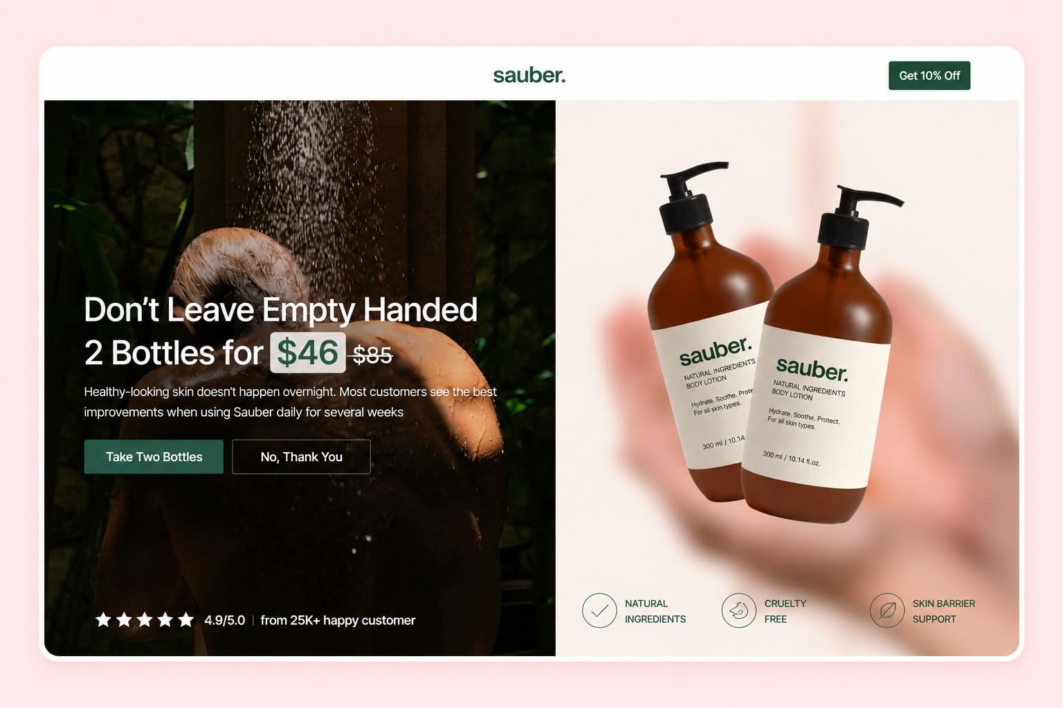
Skipping this page is the most common gap in a funnel. A decline is not the end of the conversation, and a second offer at a friendlier price converts a share of people who were only pushing back on the number.
Thank You Page
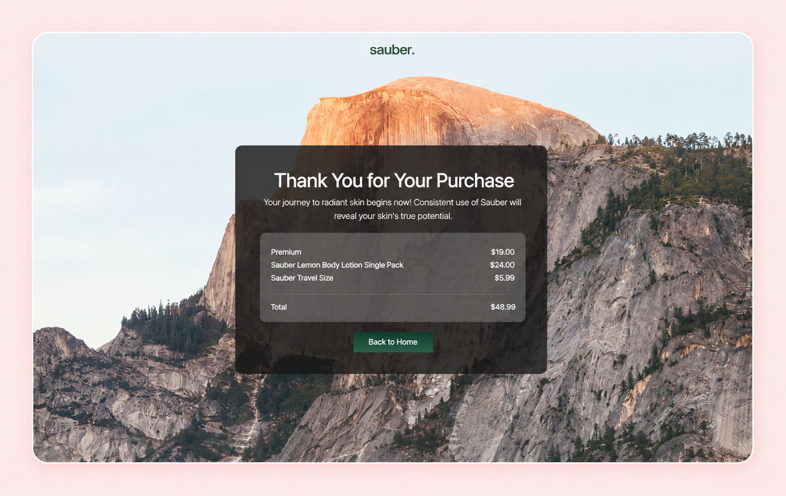
The confirmation page shows the order total and a short message about the journey to radiant skin. Treat it as the first step of retention rather than a receipt. Order tracking, a referral prompt, an invitation to a community, and the first email of your onboarding sequence all belong here.
Privacy Policy and Terms of Service Pages
Both are in the template for a reason. Payment processors ask for them, ad platforms check for them, and buyers look for them before entering a card. The skincare terms page covers product information, accuracy of descriptions, and the limits of ingredient claims, which matters in any category making health-adjacent statements.
Start with a Template for Free
What the Cart Research Says About Your Checkout
Which items sit in the cart changes how often that cart gets abandoned, and there is now solid evidence for it.
Liat Hadar, Yael Steinhart, Gil Appel and Yaniv Shani ran two large field datasets and four controlled experiments on what makes people walk away from a full cart. Their finding, published in the Journal of Consumer Research in February 2026, is that carts holding a higher proportion of hedonic to utilitarian products get abandoned more often. The mechanism they identify is guilt. A cart that reads as pure indulgence makes the buyer feel worse about the purchase, and feeling worse makes them close the tab.
The useful part is the intervention they tested. Recommending a utilitarian item alongside the hedonic ones reduced abandonment in both experiments. A practical add-on gives the buyer a justification, and the justification carries the whole cart.
Look again at the skincare bumps with that in mind. Travel size and mini sunscreen are practical purchases: one solves packing, the other solves sun protection. Sitting next to a $44 treat, they do exactly what the paper describes. If your bumps are all indulgence, you may be raising your average order and lowering your completion rate at the same time, and the two effects will hide each other in a blended conversion number.
Framing changes the outcome too. Zhiying Li and Seunghee Han tested 342 people in 2025 on bundles whose parts do not obviously go together, and found that a "free gift" frame held up where a "price discount" frame did not. Under a discount frame, an odd pairing cut purchase intention and left buyers feeling less shrewd. Under a free gift frame, the mismatched bundle scored as well as a matched one. If your bump is a stretch from the main product, give it away with a threshold rather than discounting it.
Shipping Is the Biggest Reason People Leave
Baymard Institute has tracked cart abandonment for well over a decade, averaging 70.22% across 50 separate studies. Their own quantitative work on why people quit during checkout puts extra costs at the top, cited by 40% of abandoners, ahead of slow delivery at 20% and forced account creation at 18%.
Set that against the skincare funnel's shipping options and the risk is visible.
Shipping option | Price | Share of a $44 bundle | Share of a $24 single |
Standard, 3 to 4 days | $12 | 27.3% | 50.0% |
Premium, 2 to 3 days | $19 | 43.2% | 79.2% |
Express, 1 to 2 days | $32 | 72.7% | 133.3% |
A buyer taking the $24 single pack with express shipping pays more for delivery than for the product. That combination will lose orders no matter how good the page is. Three fixes work: build shipping into the product price and advertise free delivery, set a free-shipping threshold just above your target order value, or show the delivery cost on the landing page so it surprises nobody at the payment step. The template already does the last one by holding the summary visible throughout.
What Each Page Is Worth
Here is the same funnel as an arithmetic problem, showing what the pages after the landing page contribute.
Step | Order value | Change from a single pack |
Single Pack only | $24.00 | Baseline |
Bundle instead of single | $44.00 | +83.3% |
Plus travel size bump | $49.99 | +108.3% |
Plus mini sunscreen bump | $52.98 | +120.8% |
Plus body soap upsell | $72.98 | +204.1% |
Now put take rates on it, because nobody accepts everything. Modeling 30% on the first bump, 20% on the second and 15% on the upsell across 1,000 completed checkouts:
Offer | Price | Take rate | Revenue per 1,000 checkouts |
Travel size bump | $5.99 | 30% | $1,797 |
Mini sunscreen bump | $2.99 | 20% | $598 |
Body soap upsell | $20.00 | 15% | $3,000 |
Total added | $5,395 |
Against $44,000 from the bundles themselves, those three pages add 12.3% more revenue at zero additional advertising cost. That is the number to hold onto when someone asks why the funnel needs more than a product page. Your acquisition cost stays flat while your revenue per visitor climbs, which is the mechanism behind predictable revenue growth in any ecommerce business.
Try the Free Natural Skincare Funnel Template
The funnel described above is available free. It arrives as a complete build: home page, landing page with countdown and two-option pricing, checkout with two order bumps and three shipping tiers, post-purchase upsell, downsell, thank you page, and both policy pages, wired together in order.
Start with a Template for Free
Page in the template | What it handles |
Home page | Brand traffic, trust badges, 4.9 rating from 25,000 customers |
Landing page | Countdown, first-timer discount, single at $24 and bundle at $44 |
Checkout | Order bumps at $5.99 and $2.99, three shipping tiers, reviews beside the form |
Upsell | Natural body soap at $20, one tap, card already on file |
Downsell | Two bottles for $46 for anyone who declines |
Thank you page | Confirmation and the start of retention |
Privacy and terms | The pages processors and ad platforms look for |
Every page opens in the page builder as drag and drop, so swapping the product photos, prices and copy for your own is an afternoon of work rather than a development project. The structure is the part you are borrowing, and the structure is what took the longest to get right.
Capture Leads Before They Are Ready to Buy
Plenty of visitors are not buying today. Capture leads by offering something worth having in exchange for an email, then nurture them until they are ready.
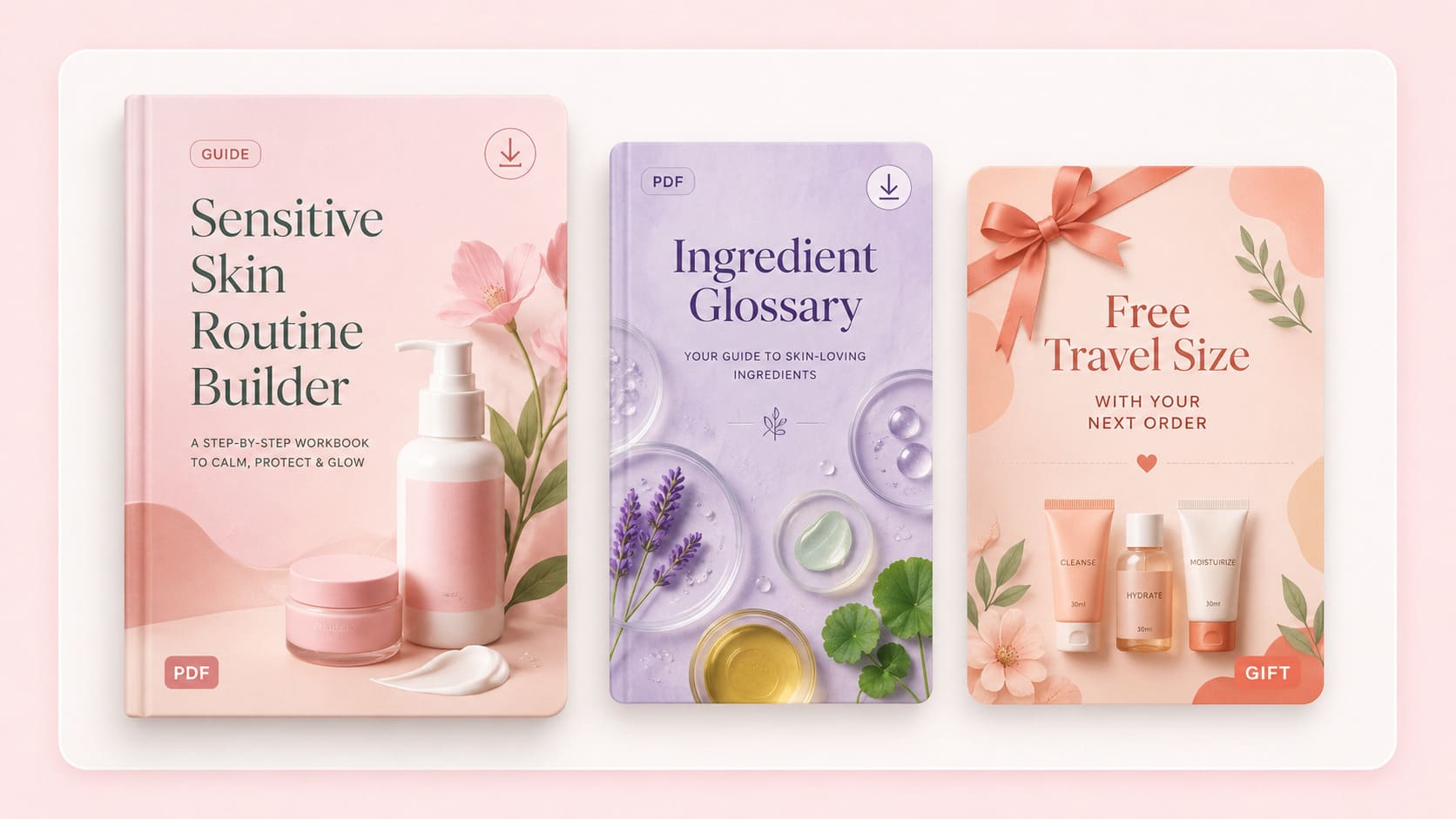
A lead magnet earns new leads when it solves one narrow problem. For a skincare brand: a routine builder for sensitive skin, an ingredient glossary, a free giveaway of a travel size with the next order. Vague valuable resources get ignored. Specific ones get downloaded.
Behind the form, automated sequences do the follow-up and convert leads who were never going to buy on a first visit. A workable cadence sends a welcome immediately, the promised asset within the hour, then a problem-focused email on day two, social proof on day five, and an offer on day seven. Each message should work through the problems and objections potential buyers carry with them, ending with the one standing between the reader and the final purchase. Automated follow-ups cut administrative tasks for sales teams and keep the sales cycle moving without manual work.
Lead scoring tells you who to contact first. Score on behavior rather than job title: opened three emails, visited the pricing page twice, watched the demo. Prospect behavior beats demographics for predicting who converts, and the score turns raw contacts into sales qualified leads your team can prioritize. Where deal complexity is high and the sales cycle length runs into months, this is where CRM data analysis earns its keep.
Track the Numbers That Show Where People Drop
Conversion metrics belong at every meaningful step. Track performance between adjacent pages rather than end to end, because a blended number tells you something is wrong without telling you where.
Transition | What a weak number means |
Home or ad to landing page | Targeting or creative mismatch |
Landing page to checkout start | Offer, price, or clarity problem |
Checkout start to payment | Friction, shipping cost, or trust |
Payment to upsell accepted | Offer relevance |
Upsell decline to downsell accepted | Price sensitivity you can recover |
Watch sales velocity alongside these, which is deal count times win rate times average value, divided by cycle days. It moves when any input moves, and cutting cycle days usually moves it most.
Real time data changes what you can do about a problem. Seeing the checkout drop the morning a shipping rate changed lets you fix it the same day. Reviewing it monthly means eating the loss first. Funnelish analytics reports page by page, so the drop shows up against the page that caused it.
One warning on sales forecasting: a funnel with few deals produces noisy numbers. One extra sale on a base of twelve lifts your rate by more than 8% while meaning nothing at all. Wait for volume before you draw conclusions, and compare periods of similar length.
Where First Funnels Break
Sending ads to the home page. Paid traffic needs a page with one path. Home pages offer several.
Asking for too much at the form. Every extra field costs completions. The skincare checkout asks for what shipping requires and stops there.
No downsell. You have already paid for the visitor. A second offer costs you one page.
Slow pages. A checkout that takes four seconds to appear loses buyers who were ready. Page speed is worth checking before you touch the copy.
Different promises on different pages. If the ad says gentle and the landing page says clinical strength, the mismatch reads as a bait and switch.
Treating the thank you page as an ending. Onboarding, referrals and repeat purchases all start there, and they are the cheapest revenue in the business.
Start with a Template for Free
Frequently Asked Questions
What Are the Four Stages of a Sales Funnel?
Awareness, Interest, Decision and Action. Prospects recognize a problem, research what solutions exist, compare specific options, then buy or opt out. Many teams add Retention as a fifth, since keeping a customer costs far less than finding a new one.
How Long Does It Take to Build a Sales Funnel?
Working from a template, an afternoon for the pages and a day or two for the copy and product photos. Building from scratch takes a week or more. The offer and audience research is the part that takes real thinking, and it pays to do that before you open a builder.
What Is the Difference Between a Sales Funnel and a Sales Pipeline?
A sales funnel describes the buying journey from initial contact to purchase. A sales pipeline describes your side of it: the stages your sales reps move a deal through. One is measured in conversion rates, the other in deals and stage duration. Funnels tell you where prospects leave; pipelines tell you where deals stall.
Do I Need a Sales Funnel for a Small Online Business?
Yes, and the smaller the budget, the more it matters. A funnel raises revenue per visitor without raising traffic costs, which is exactly the constraint a small business is under. The skincare example above adds 12.3% through three pages that cost nothing to run.
How Much Traffic Does a Sales Funnel Need?
Enough for the numbers to mean something. Below a few hundred visitors per page, conversion rates swing too much to guide informed decisions. Run the funnel, gather a month of data, then start optimizing.
Should the Upsell Come Before or After Payment?
After. A pre-payment upsell adds a decision while the buyer is still deciding whether to trust you. A post-payment upsell asks someone who has already committed, with their card on file, which is why it converts better and costs nothing if declined.
Table of contents
Boost your eCommerce
sales today

24/7 support
No credit card required
Cancel anytime
24/7 support
No credit card required
Cancel anytime
